
The 60-30-10 rule - what it is and how to use it to your advantage

Decorating your home should be exciting and inspiring but the number of different colour choices, trends and design ideas can make it rather confusing and overwhelming. And as you go to decorate you might have stumbled across the 60-30-10 rule and wondered what it is and how you can apply it to your own home. If done correctly, it could help you to get the balance right when it comes to your interior design. But what is the 60-30-10 and how can you use it in rooms in your home?
We all have colours that we gravitate towards, whether that be a specific colour of paint or decor accents. You might have only been thinking about which colour combinations work together. However, the proportions of these colours in certain rooms can have a big impact on the overall look of a space.
'The 60-30-10 rule creates a clean and consistent colour palette for the room, starting with a backdrop, almost like a canvas, that allows for beautiful furniture and decor to stand out whilst also complementing one another,' explains Sarah Lloyd, Interiors & Paint Specialist, Valspar Paint.
It also ‘takes a lot of the stress and uncertainty out of choosing colours for your walls, furniture and soft furnishings,’ according to MyJobQuote.co.uk’s Interior Design Expert, Ryan McDonough.
But how can you use it to your advantage and make it work for you?
What is the 60-30-10 rule?
‘The 60-30-10 rule refers to the recommended distribution of colours throughout your interior design,’ admits Promain’s Manager, Ben Thomson. ‘The rule suggests allocating 60% of a room's colour to the dominant hue, 30% to a secondary colour and 10% to an accent colour. This philosophy leaves you with a cohesive colour scheme that's both visually appealing and balanced.’
‘The first element of considering the 60-30-10 rule and any design scheme is to approach the walls, as they dominate an interior space more than any other component, so creating interest here is key,’ adds Martin Waller, Founder of Andrew Martin.
‘The secondary colour adds contrast to the room. This colour can be used in furniture, curtains, area rugs, bedding or an accent wall. You’ll want to choose accessories that complement the dominant colour palette of the space. This will help pull a room together and create a sense of cohesiveness.’
And ‘lastly, the accent colour is used to contrast and complement your decor scheme. Typical accent pieces such as throws, lampshades and artwork are great for bringing a room together,’ Martin concludes.
If you’re still wondering how to embrace the 60-30-10 rule in your home, the experts have broken it down further when it comes to specific rooms.
The 60% colour rule
So the '60' in the 60-30-10 colours rule should take up 60% of the space. 'Start with the 60% which represents the main colour you are choosing for the room,' advises Asli Çeçen, founder of homeware brand Sazy.
'As this is the dominant shade, it needs to provide a stunning backdrop that you can base your second and third colours against. This can therefore be wall colour or bigger pieces of furniture like sofas or headboards.'
'This will be the main colour in your room so walls, or large items such as sofas, and rugs,' agrees Sarah from Valspar Paint.
The 30% colour rule
Next up we have the '30'. 'The 30% represents the secondary colour which is there to support the primary colour, adding interest and contrast,' says Asli from Sazy.
'You want this to be less than half the amount of colour in the room, and it will need to support the main colour,' explains Sarah from Valspar. 'This colour is usually featured in curtains and smaller furniture pieces such as side chairs.'
The 10% colour rule
Finally, we have the '10' which may be used the least but isn't the least impactful. 'This will only be 10% of the room, will be for soft furnishings such as throws, pillows, artwork and accessories,' says Sarah from Valspar.
'The accent colour doesn’t necessarily have to match the others but still compliment them well. A brighter tone always looks nice such as a pink or gold.'
Why does the 60-30-10 rule work?
But why have designers decided that this proportion of colours works the best? 'It works well mainly because it can help to create a cohesive colour scheme,' explains Emma Deterding, Founder and Creative Director, Kelling Designs.
'With the secondary and accent colours complementing the dominant colour, it helps to provide a balanced feeling across the space, keeping it grounded and easy on the eye and it offers flexibility in that it works with any colour palette, from bold brights to monochrome and neutrals.'
'It’s difficult to go wrong with this colour guideline,' adds Michael from The Paint Shed. 'The rule works well when the space is large and open-plan keeping the space less busy and overwhelming due to the simplicity of three colours only.'
How to apply 60/30/10 colour rule in different rooms
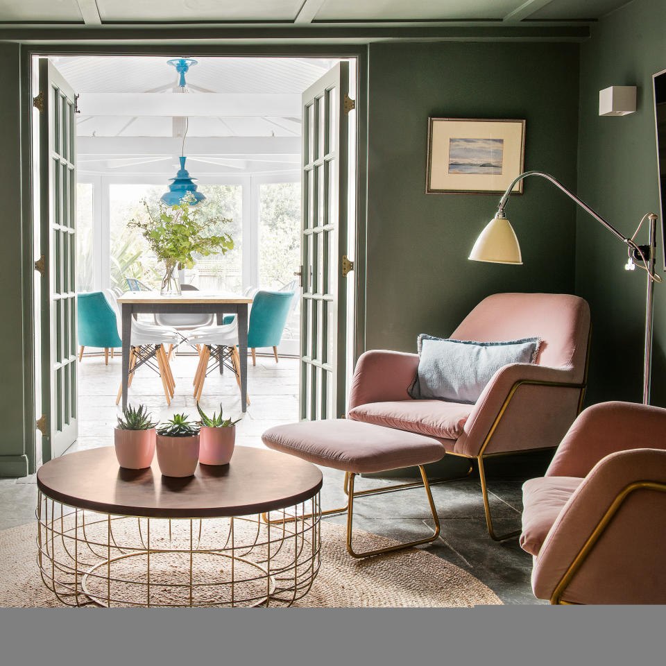
In the living room
In a living room, it’s most likely that the 60% will go towards the wall colour or even the sofa. Curtains, chairs and even storage such as shelves will make up the 30% and you can add brighter or darker accents through accessories like cushions, a rug, artwork or even a vase, for the 10%.
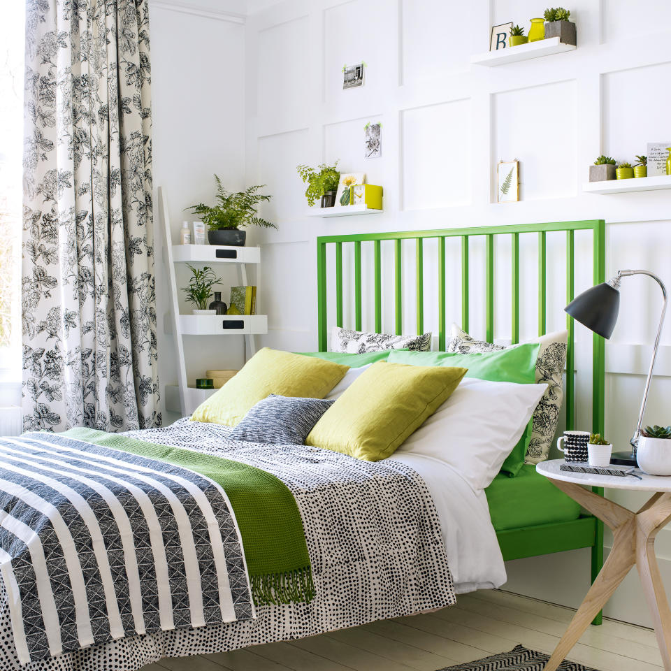
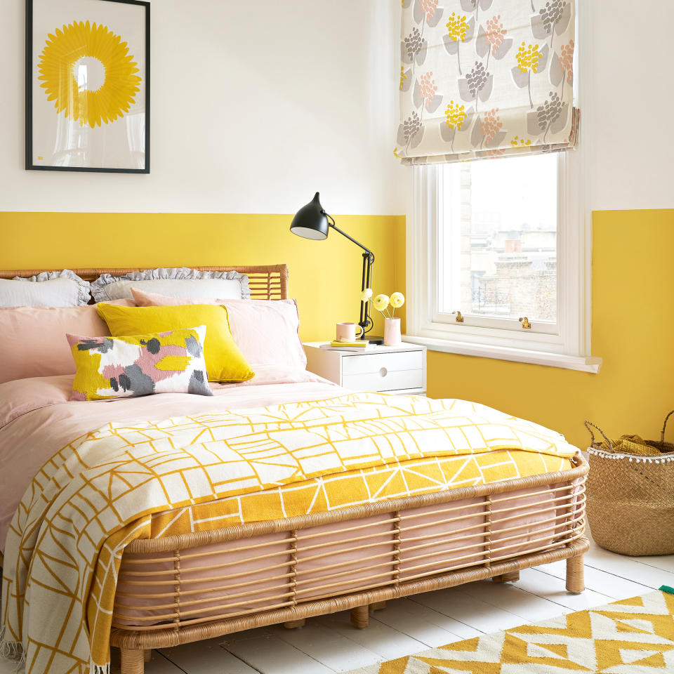
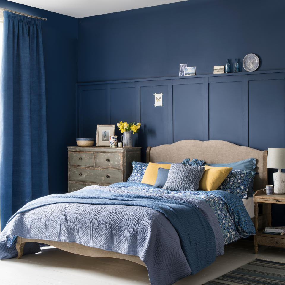
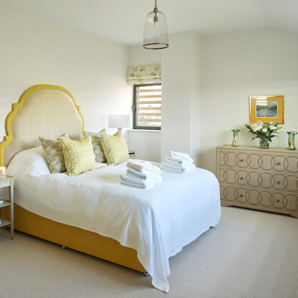
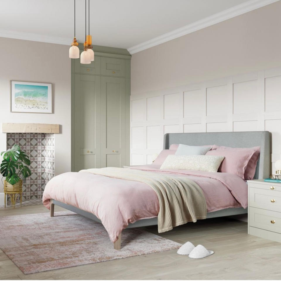
In bedrooms
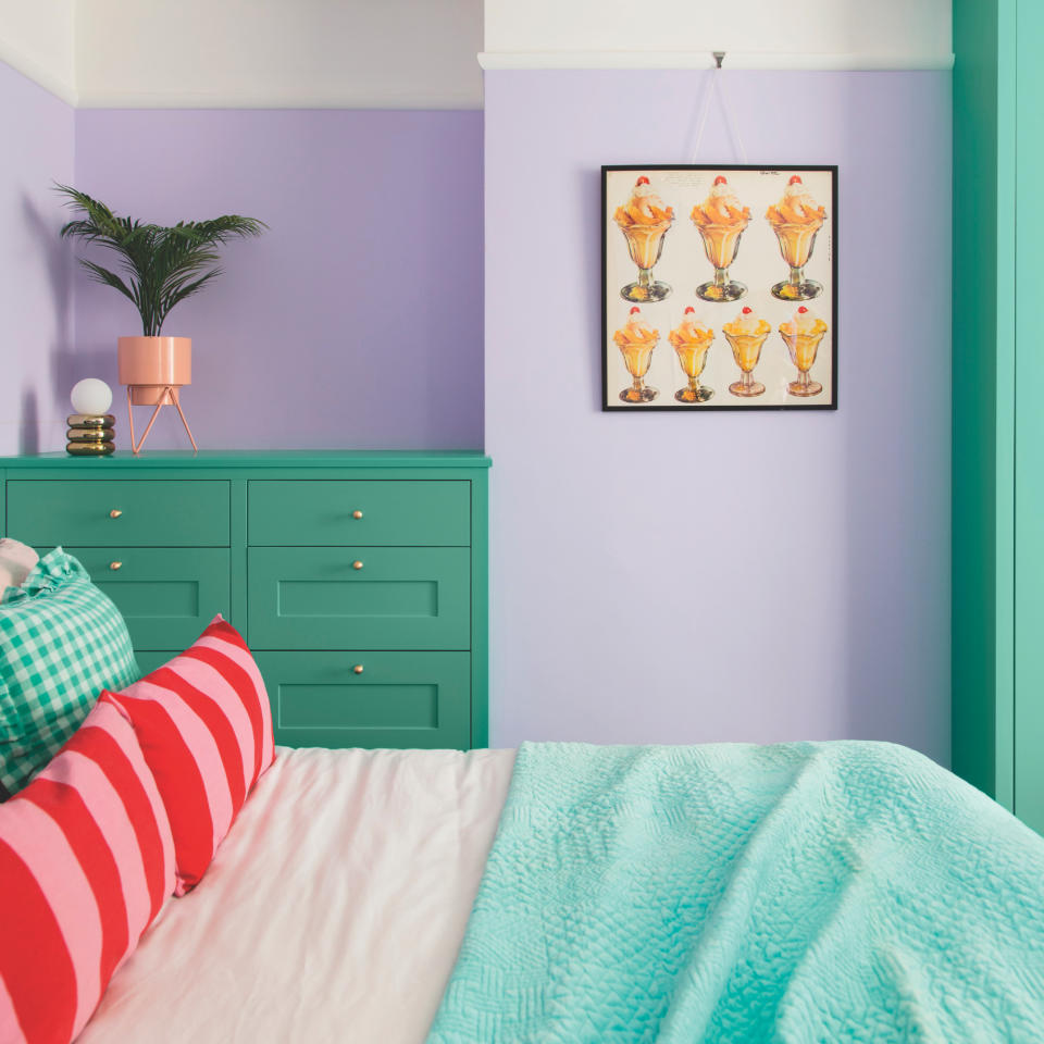
‘Since most of the time the bedroom is smaller than the living room, it’s important to choose what the main colour background will be - either the bed or the walls,’ says Evelina Juzėnaitė, Principal Interior Designer at Planner 5D.
For the 30%, ‘you can paint one wall an accent colour and add textiles such as curtains, a rug, or a blanket on the bed,’ Evelina continues. And the 10% can be made up of pillows, lamps by the bed and any decor that you might have on your dresser.
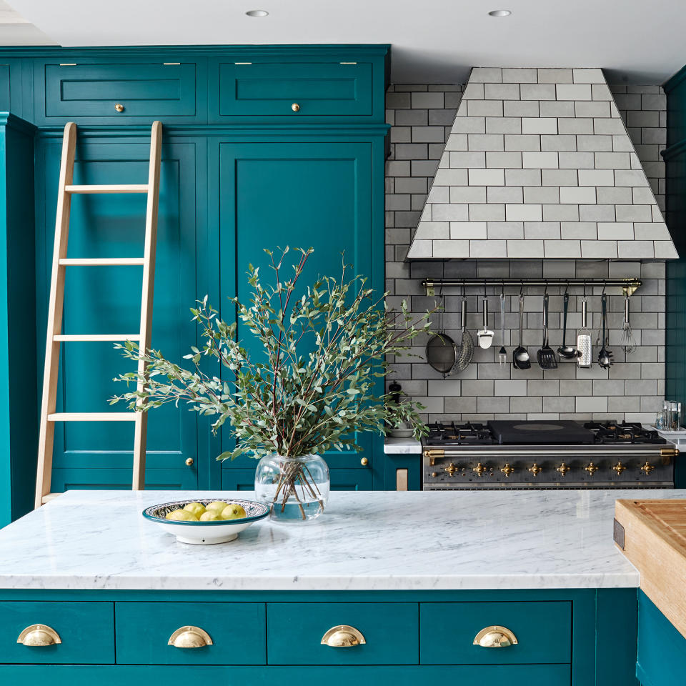
In the kitchen
When you think about it, we don’t tend to change our kitchens all that often. Because of this, ‘it’s more important than ever to think about the proportions of each of the colours in this space,’ outlines Ann Marie Cousins, Interior Designer at AMC Design.
Evelina suggests that ‘unlike the living room, the main colour in the kitchen is not often on the walls but on the cabinets,’ so this is where your 60% should fall. ‘30% should be the dining table or chairs, the back wall of the kitchen or the upper cabinets. While 10% can be dishtowels, dishes and flower pots.’
In the bathroom
‘In bathrooms, the best colour combination for 60-30-10 would typically involve a dominant colour that's neutral, like white, beige, grey, or soft pastels like light blue or pale green. These colours create a calming and clean atmosphere, perfect for a bathroom,’ says James Robert, Director of Sanctuary Bathrooms.
‘The secondary colour, which takes up 30%, can be a slightly stronger shade of the dominant colour or a harmonious colour,’ he continues. And finally the ‘the accent colour (10%) should be a pop of colour that adds interest and personality to the space, such as navy blue, emerald green, or vibrant yellow. Or you could incorporate darker tones or metallic finishes such as black, brass or gold to bring the room together for the accent colour.’
How to use the 60-30-10 rule in neutral schemes
Although the 60-30-10 rule may seem only relevant for bright and colourful spaces, neutral interiors can benefit from these proportions as well.
'It is the same whether you are using bold, strong colours or more neutral shades, but with a calm look just make sure you introduce at least one strong colour to help ground the space and help make sure it doesn’t look too washed out,' advises Anna from Fenwick & Tillbrook.
'For instance use a deep charcoal grey or chocolate brown as your 10% through cushions, lampshades or a small side table.'
'Texture is really important in neutral schemes that follow this rule,' adds Sarah Barclay, Creative Director, Barclay Interiors. 'If you choose three neutral tones, consider how you define them through texture and material choices. Layering textures will help a space feel inviting and three-dimensional.'
How to use the 60-30-10 rule in monochrome schemes
It may sound surprising, but monochrome schemes can look to this rule as well.
'When using the 60-30-10 rule in a monochromatic scheme, one recommendation would be to use white as the dominant base colour which would be your 60 including using white paint on the walls,' says Michael from The Paint Shed. 'We would then recommend grey as your 30 colour and then black as your 10.'
When to break the 60-30-10 rule
As much as the 60-30-10 rule has been proven to work in creating a balanced and considered scheme, sometimes rules really are made to be broken.
'There are no hard and fast rules, and the 60-30-10 rule can be adjusted depending on the colours being used, whilst allowing for a unique look,' agrees Emma from Kelling Designs.
'Designers often adjust the percentages based on space and the overall aesthetic we're trying to create - ultimately, it's about creating a colourful design scheme that is balanced, harmonious and easy on the eye.'
What could you use instead of the 60-30-10 rule?
'For example, you could do a rule of 70-20-10,' suggests Sarah from Valspar. 'Every room is different and people have different tastes, so take some time to figure out what colour scheme would work best for your space.'
'One way you can break the rule whilst still keeping to its main concept is by adding another 10% to the equation. This would mean having two accent colours instead of one,' says Michael from The Paint Shed.
'Whilst designing your space, pay attention to the balance between the colours in the space. If your 60 colour is weighing more of the space and it feels off, then you can make adjustments to find the balance that is right for the space.'
'For example, if you love white walls but 60% of white in your room might make it feel too bland and lack personality then you could adjust the equation to 50,40,10.'
'As with any decor rules, they should be used as a guide and you should always design your space how you want it,' concludes Michael. 'After all, it’s you that will be spending the majority of your time there!'
FAQs
What is the best colour combination for 60-30-10?
‘The best colour combination for the 60-30-10 rule depends on personal preference, the mood you want to create and the specific space you're designing,’ reveals Kate Palmer, Creative Director at The Painted Furniture Company. ‘However, a classic combination could be a calming blue as the dominant colour, complemented by neutral tones like cream, beige or grey as the secondary colour, and vibrant accents such as mustard yellow or coral for visual interest.’
Emma Bestley, Creative Director and Co-Founder of paint company YesColours, concurs. 'Examples of winning colour combinations include a deeper blue, with a blue-violet and a teal green. All on the cool side of the colour wheel, but create an opulent setting when grouped together,’ she proclaims.
‘For those that prefer a more subtle contrast, accessories made from natural materials combined with greenery can also be used as your 10%. The 60-30-10 colour rule doesn't have to limit you to 3 individual colours, for example, a mix of neutrals could be combined to make up the 30% element so long as they are all from the same tonal palette,’ Kate concludes.
Are there any other colour rules that we should be following?
While the 60-30-10 can be really helpful if you’re looking for design inspiration, there aren’t really any hard and fast rules for how to use colour in your home. Actually, there are a number of colour rules you should be breaking to take your space to the next level. But in general, ‘referring to the colour wheel is always a foolproof way to ensure you are pairing colours which work well together, affirms Ellie Kennedy, Interior Expert at 247 Blinds.
‘Turning to complementary colours is one way of doing this, but those who are looking for a colour pairing that is more subtle, but still bold, should consider opting for analogous shades - colours that are adjacent to each other on the wheel, such as green and yellow,’ she concludes.

