
Whatever your favourite hue, we have the products and decorating tips to help you make it work in your home...

Colour can make you happy. A splash of yellow to brighten your day or a cooling blue to calm your mood; the shades you choose have the power to affect your wellbeing. Whatever your favourite hue, we have the products and decorating tips to help you make it work in your home...
Red

Red is bold and elemental: the colour of fire, blood and passion. Numerous tests have proven its ability to pack a psychological punch: waitresses wearing red tend to get higher tips, and sporting teams with red kits win slightly more frequently.
Unsurprisingly, considering its power over the human psyche, we have been daubing this colour on the walls of our homes since the Paleolithic era. But various shades of red can be used to convey very different emotions.
Pale reds – all right, pinks – run the gamut from saucy to girlish with ease. Saturated, earthy, rust-toned hues can evoke an energetic, primal mood, but add a little grey to recreate the dark brick of the walls at Herculaneum and they become weighted with the gravitas of classical history.
Bluer, bloodier shades are intense, regal and as warming as a hot toddy, perfect for dining rooms or gallery walls, while geranium and scarlet can be used like bolts of pure energy. Applied sparingly in a black-and-white palette, red will always look modern and dramatic.
Orange

Before the word entered the English language sometime during the 16th century – it came from the fruit, by the way – orange was known as geolu-reade or yellow-red. You shouldn’t, however, let its relative youth fool you: orange is by nature a brash and eye-catching attention seeker.
But this ‘look-at-me’ quality, which makes it so useful in road warning signs and brand logos, can put people off using it in the home. This isn’t quite fair. When used with confidence in a carefully considered scheme, orange can make a room sing. But it is also not for the faint of heart: get it wrong and you could turn your living room into something resembling the interior of an Easyjet lounge.
Fully saturated shades look fantastic as an accent for white and black. For mid-century enthusiasts, it can create brilliantly dramatic moods paired with deep blues and dusty greens. Those looking to dip their toes into the colour should consider either the burnt-amber, terracotta end of the spectrum or the washed-out tints that hover tantalisingly on the verge of apricot or pale coral.
Yellow

From the butteriest creams to the most sinus-stinging citruses, yellow is surely the workhorse of the colour world. This is a relatively recent development: before the 19th century there were very few stable yellow pigments. Ochres were cheap and plentiful but dull, and artists’ pigments, like Orpiment and Naples Yellow, were too expensive for most domestic projects and prone to toxicity and discolouration.
Although it has had negative connotations as a symbol of social stigma, yellow is now usually associated with confidence and optimism. It is also welcoming – good for entrance halls – and stimulating, so best avoided in bedrooms. It is fresh with white; bold with greys, blacks and blues; and opulent with shades of purple.
The vast array of hues available mean it is possible to create a spectrum of different moods with just this colour. Muted, golden shades can feel timelessly elegant, while splashes of acid yellow signal sharp modernity.
Green
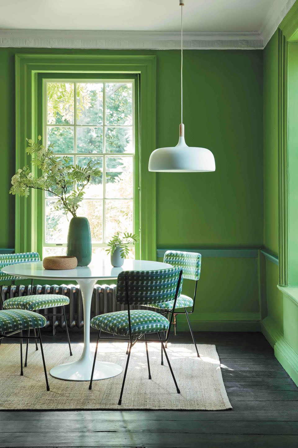
Symbolically, this colour is associated with luck, money, regeneration and cleanliness, which is why soaps and detergents are often green and pine- or apple-scented. And most importantly, perhaps, for city dwellers, green evokes pastoral landscapes beyond the urban limits. Because a fascination with the natural world is nothing new, greens have a long pedigree when it comes to interior design.
Pale, easy-on-the-eye shades have been perennials since the Adam brothers’ reign over Georgian architectural taste. For the Victorians, deep tones like sage and Brunswick were the height of fashion, even though the pigments used to create them were extremely poisonous. (It was long believed the arsenic-rich, Scheele’s Green wallpaper in Napoleon’s room on St Helena was responsible for his death – it wasn’t, but it probably didn’t help.)
A century on, while the environmental movement was kindling during the 1970s, everything from kitchen cupboards to macramé wall hangings was saturated with avocado hues. For something bolder and more modern, try bottle, emerald and jungle greens.
Blue
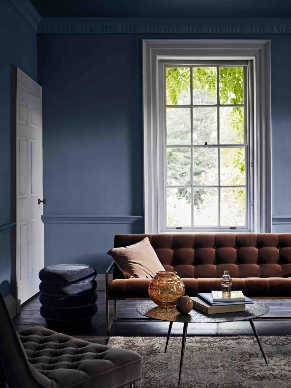
A recent YouGov survey suggested that blue was the world’s favourite colour. Small wonder: it is both optimistic and spiritual. Clear blues feel thoughtful and dreamy.
And, like green, blue has a hygienic reputation: it was often used in Victorian kitchens and colonial verandas, because it was believed to deter flies.
The colour has a melancholic side, too. When we’re sad we say we’re blue, and it is believed to be the spectrum’s coldest colour. This, incidentally, has only been the case since the 18th century – previously it was considered one of the warmest colours. This makes sense: it’s true that ice can be blue, but so are summer skies and seas.
Blue rooms feel large and airy. Plus, while blue is often pigeonholed as overtly masculine
and reserved for little boys’ bedrooms, it is, in traditional Western art, symbolic of the Virgin Mary. From sometime around the mid-12th century she was usually painted with ultramarine, the most expensive pigment available, in tribute to her status as Christianity’s first lady.
Violet

When Sir Isaac Newton developed his ideas on the light spectrum in the 1660s, he didn’t mention purple. So while it is now not considered a ‘true’ colour, violet, the shortest wavelength visible to the human eye, is. Scientific semantics aside, few would deny that officially these hues are from the same family.
Like orange, violet is not for the meek. It’s a difficult colour to work into a balanced palette. Designers are fond of using muted, dustier tones with acid yellows and greens in public spaces, but this would pall quickly in your home. And some shades can, even on their own, quickly feel overwhelming and gaudy.
Dark, saturated shades evoke royalty and Victorian splendour – mauve was the colour of the 1860s and beloved by Queen Victoria herself – yet it can still feel contemporary and clean when used with inky blacks. Lighter, flowery purples, on the other hand – lilac, lavender and heather, for example – are perceived as youthful and feminine, perfect for soothing bedroom.
Black
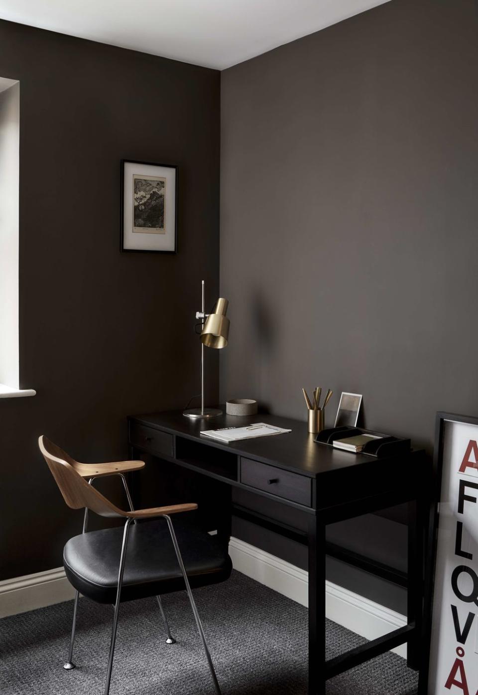
Although spiritually black’s associations are almost uniformly negative – witchcraft, ignorance, fear, depression – visually it has a better reputation. It has been fashionable in clothing since the late Middle Ages and its popularity shows no signs of waning.
For traditionalists, using black in the home is nothing new. Applied with a light touch, black details such as iron curtain rails and lamps act like punctuation marks, preventing a largely pale room from looking bland. Painting entire rooms charcoal, though, is a relatively new idea (it would have been highly impractical before the advent of electricity anyway).
Far from looking satanic or gloomy, black tones can be surprisingly comforting. With clever lighting and an ever-growing range of shades on offer, it’s never been easier to go over to the dark side.
White
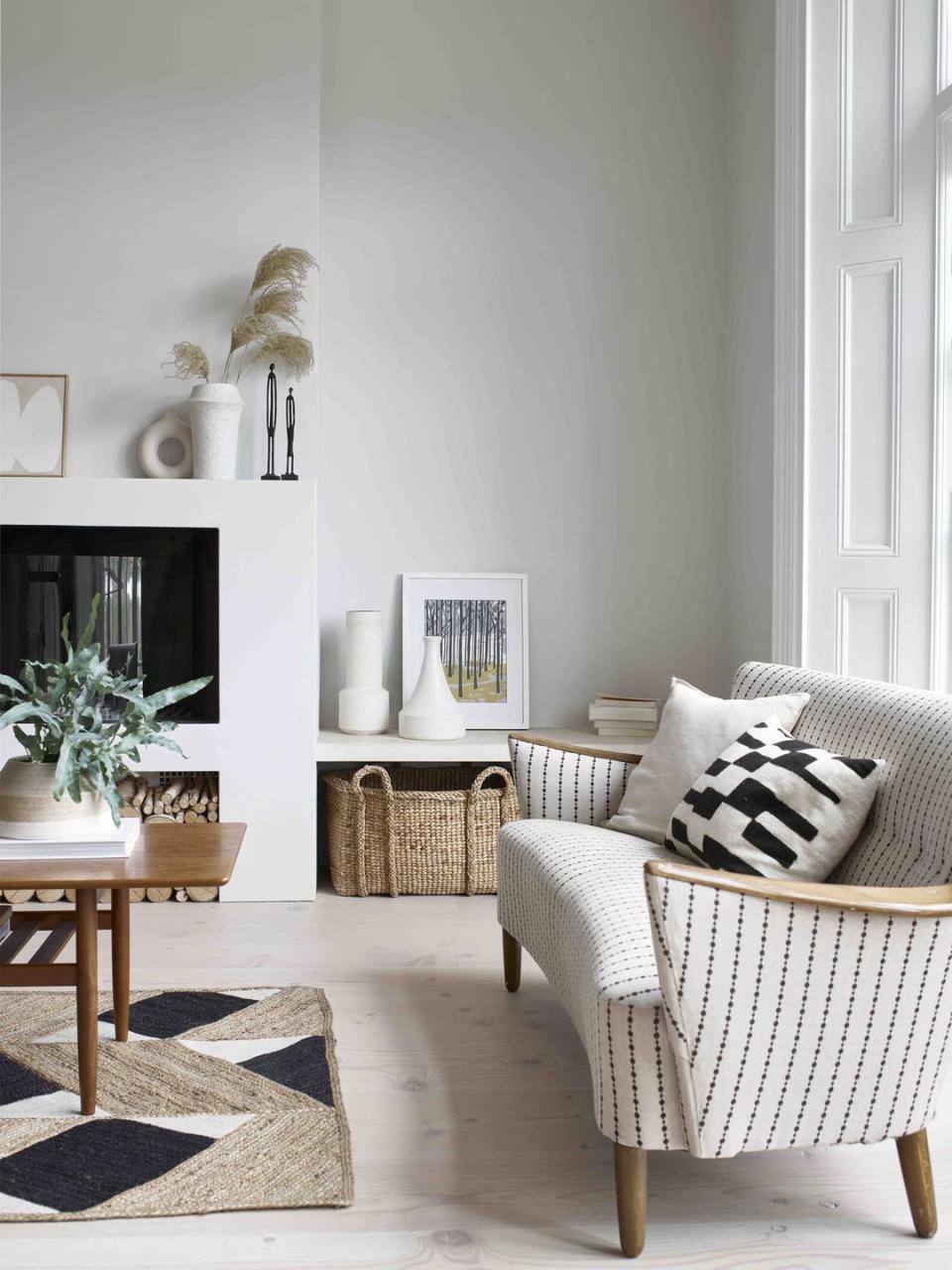
Of course the first thing that white makes us think of is cleanliness – white goods, white teeth, white linens – and purity. But it can, if too stark, seem either overly bland and corporate or high-maintenance. It is a myth, too, that white is somehow easy and works with everything.
Like every other colour, it deserves consideration. The tricky part is finding the right white. This is no mean feat when every paint company on earth boasts more shades of white than any other colour and each one will transform when placed in different lights and next to other colours.
Very few paints are completely white, but are laced with other colours like yellow, red and occasionally black. The secret to picking a white that will suit your home is matching the undertones to the other colours in the room, or, if in doubt, picking something that reads as neither overly cool nor warm.
The effort will be rewarded: a well-chosen white will make a palette sing. Complex colours, edged diplomatically with pallid woodwork and punctuated with pale doors, are tamed and made liveable.
This feature appeared in ELLE Decoration April 2016
Like this article? Sign up to our newsletter to get more articles like this delivered straight to your inbox.
Keep your spirits up and subscribe to ELLE Decoration here, so our magazine is delivered direct to your door.

