
Top interior design mistakes to avoid – according to the experts
From selecting unflattering paint colours and high-maintenance materials to overcrowding your kitchen, there are an abundance of interior design mistakes that are all too easy to make. So, I’ve asked eight experts to reveal the biggest style sins you should avoid at all costs. Here, they share their unfiltered thoughts on what not to do when decorating your home.
Cold and draining shades
“The property development world is still stuck on this awful tone of drab, soul-destroying grey. Avoid cold and draining colours. They may sell properties, making a home appear like a blank canvas – but no one actually wants to live with them. Embrace warmer neutrals instead,” says Philippa Thorp, founder and director of London-based design studio Thorp.
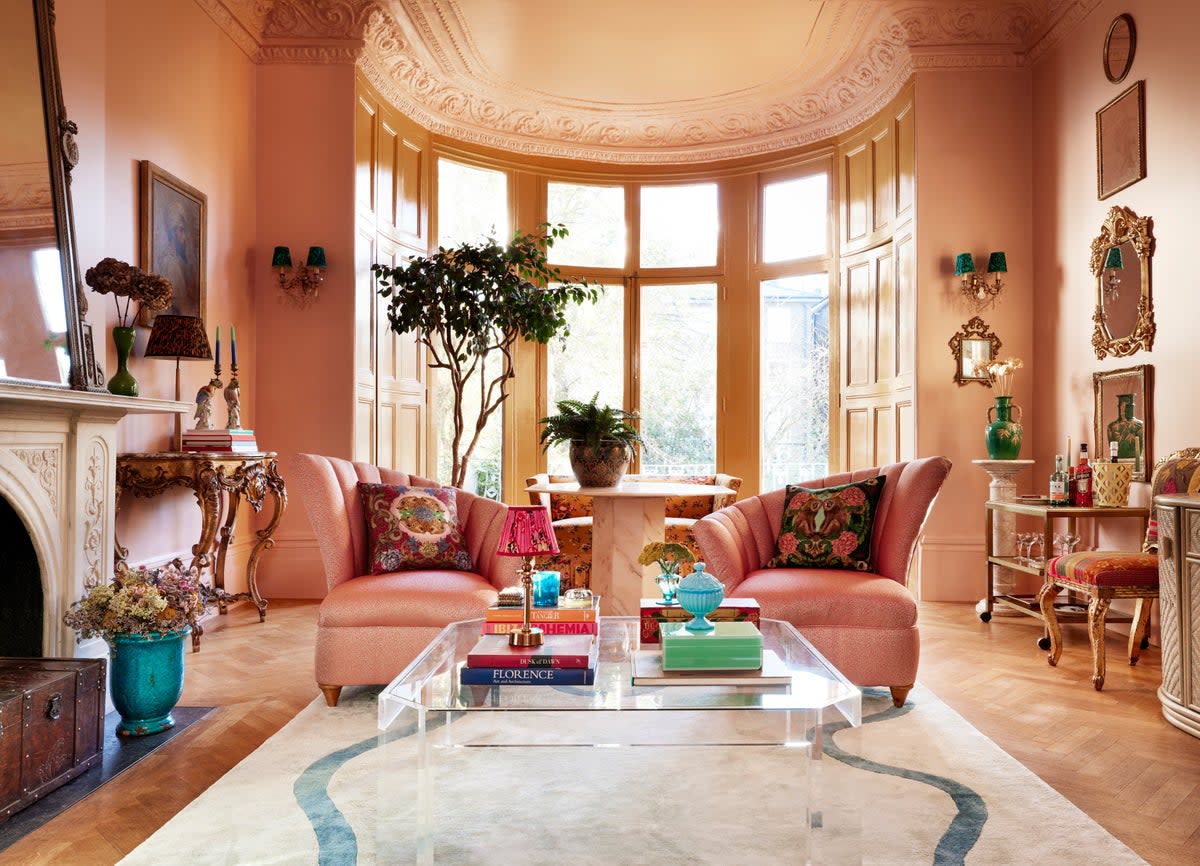
Stark white walls
Likewise, Martin Waller, founder of design house Andrew Martin, notes: “Everybody likes to paint their walls white, thinking it will give the room a crisp and clean look, but it’s actually a very stark and unforgiving colour – especially if your walls have any slight blemishes. It makes everything that’s not perfectly curated look messy.”
Interior designer Matthew Williamson recommends: “Instead, paint your walls in a soft shade of blush or plaster pink. It’s a much easier colour to live with than white, and has more personality than beige or grey while still maintaining a neutral tone.”
Choosing aesthetics over practicality
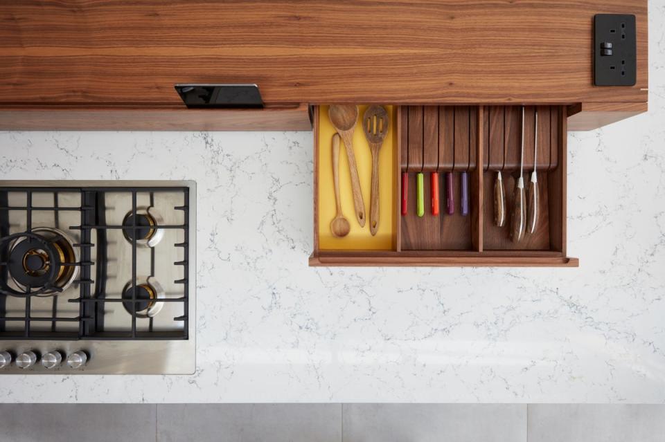
Avoid high-maintenance, delicate materials – especially in high-traffic spaces. “Kitchens are a busy place, and the worktop, more than any other part, really takes the brunt of this. Don’t make the mistake of choosing the wrong material,” advises Jonathan Stanley at premium surface brand Caesarstone.
He continues: “Natural stone, such as marble, is highly susceptible to staining. To avoid substantial damage, you would have to seal your marble countertops at least annually. Engineered stone, on the other hand, requires virtually no maintenance. It offers a beautiful, natural aesthetic whilst being extremely durable and practical.”
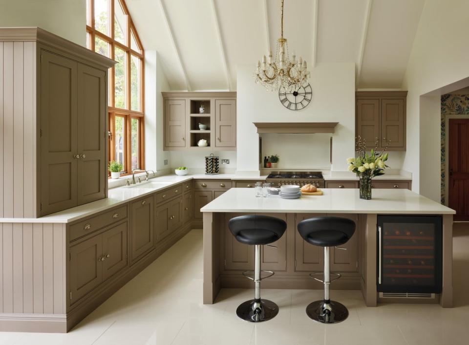
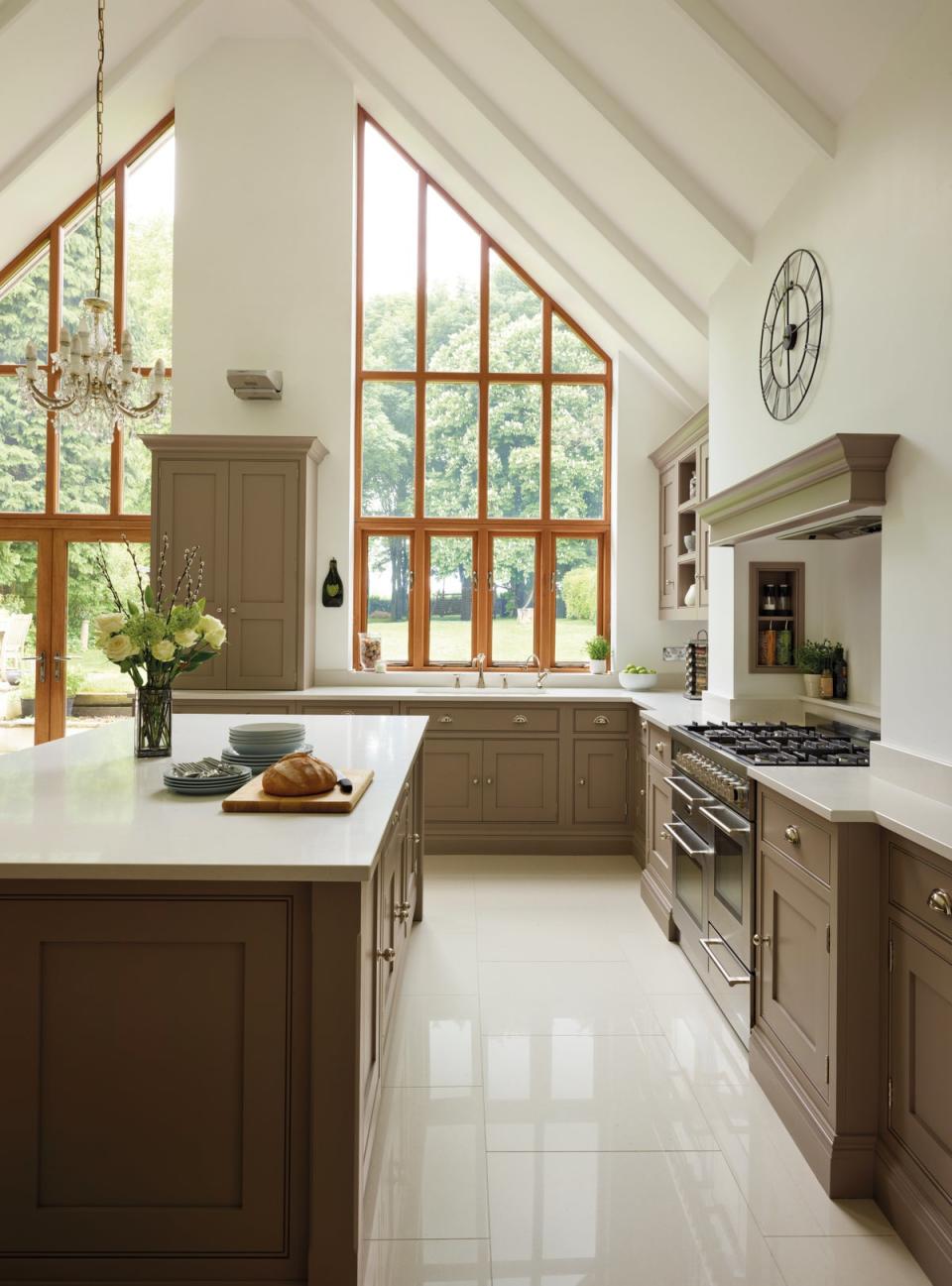
Sacrificing kitchen floor space
Don’t force an island into a space that’s simply not big enough. Tom Howley, design director at his eponymous kitchen company, explains: “Kitchens need to be as functional as they are beautiful, and sacrificing floor space to fit an island will just give an awkward, uncomfortable look. The importance of walkway space should be a key consideration. When designing your layout, always leave a metre of walkway space on either one or two sides of your worktop, island, or peninsula counter.”
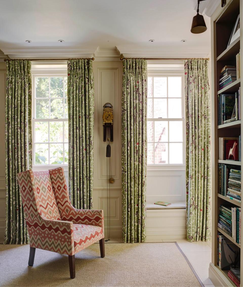
Repeating prints
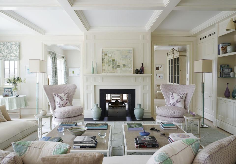
“I absolutely hate the overuse of busy fabrics within a scheme. The same pattern should not be used for curtains and cushions and your headboard – everywhere, on everything. It’s lazy decorating and gets visually tiring,” says Laetitia Thorp, interior designer at Thorp. “Generally speaking, you shouldn’t use the same fabric multiple times in the same room. It’s much more effective to create layers using differing but complementary colours, patterns and textures.”
Not considering lighting conditions
Don’t forget that colours may take on different hues when viewed under certain types of lighting. This is especially important when selecting flooring.
“Since the floor takes up so much surface area in any space, it has a significant impact on the aesthetic of your home. Remember that different lighting conditions will affect the way your floors look,” explains Neel Bradham, CEO of flooring brand Parador. “Make sure to look at your favourite flooring sample in a variety of lighting – natural, warm, and cool-toned – to double-check you’re happy with it before installing throughout your home.”
‘Karate-chopped’ pillows
“I will never karate-chop cushions – it’s a look you often see in photos, where they’ve sliced down the middle with their hand so that the top corners stick up like bunny ears. I think it looks highly contrived. Instead, simply fluff them up and let them be,” says Philippa Thorp.
Los Angeles-based interior designer Martyn Lawrence Bullard agrees, emphasising: “The karate-chop of a pillow is as dated as wearing Brut aftershave, just more offensive!”

