

25 pretty pastel colour ideas
The pastel aesthetic is nothing new – sugary hues were popular as far back as the 18th century, used with abundance in decorative Rococo interiors – but there is something of a contemporary resurgence, evidenced by the 25 million #pastel posts on Instagram.
And, although pastels tend to be used a bit more sparingly in interior design than in the world of fashion, they are a surprisingly versatile and effective addition to most design styles.
Pastel colours are the ultimate in ready-made colour combinations, all sharing pale or white undertones that make them perfectly compatible with one another, so you can pile pastel pinks, blues, yellows, greens or purples together with abandon. And an easy way to prevent your pastel design scheme from becoming overly saccharine is to introduce monochromes – black or grey accents work particularly well in this instance – and we've included tips on how to combine both.
Read on for 25 pastel room ideas that run the gamut from sophisticated and traditional, to playful and modern...
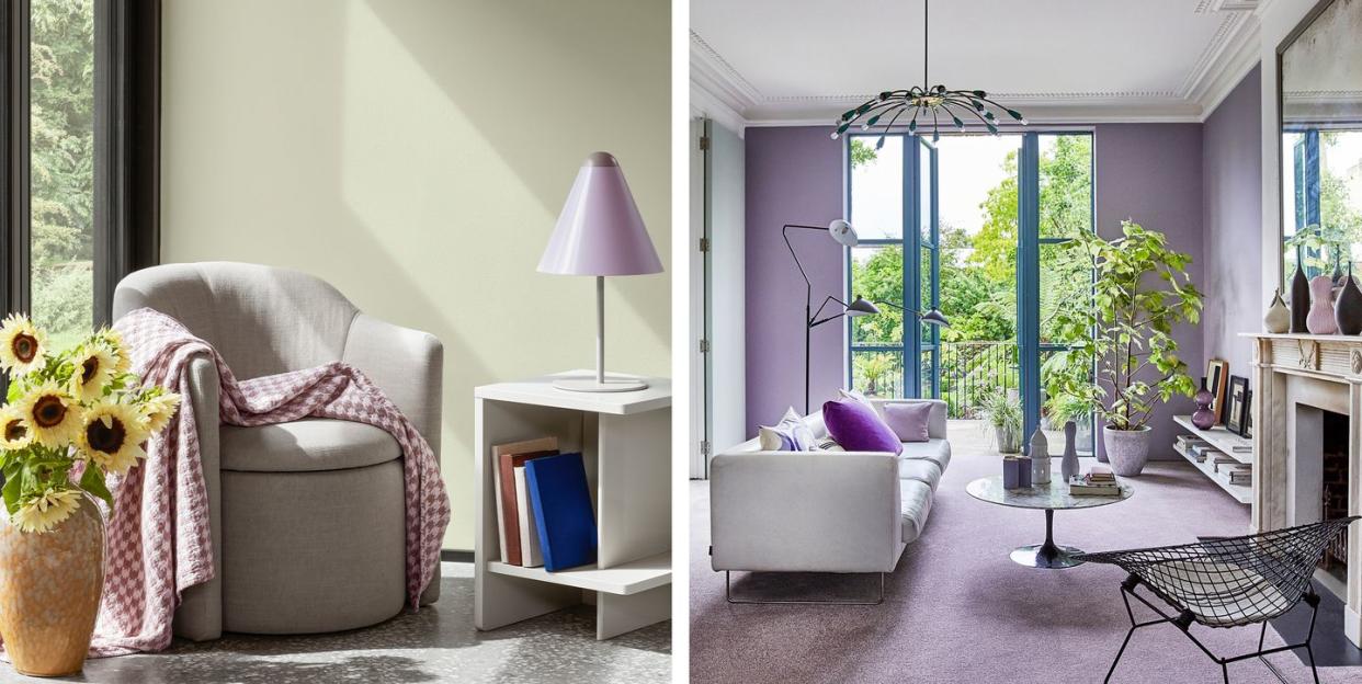
Calming pastels
This is a great example of using pastels in a really sophisticated and serene way – it's certainly not all sickly sweet pinks and purples. This is also a nice one to reference for living rooms with an all-over pale colour scheme. The modest accents of black provide some contrast but there is a real embrace of pale and delicate tones.
Pictured: House Beautiful Ada Chenille Left Hand Facing Sofa at DFS
Fearless pastels
For those who like to wholeheartedly embrace a theme in their homes, this is a fearless approach to using pastels. It's made visually interesting with a variety of textures, shapes and layers on a serene pink backdrop.
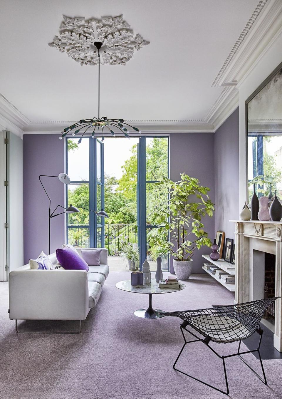
Shades of lilac
This elegant living room is a masterclass in using all-over pastels in the home without becoming too saccharine. A chalky lilac across walls and floors becomes altogether less sugary when mixed with pale stone and striking black accents. It's decorating at its bravest, and we love it.
For a great choice of muted pastel shades, try the Southwold Saxony Carpet range at Carpetright.
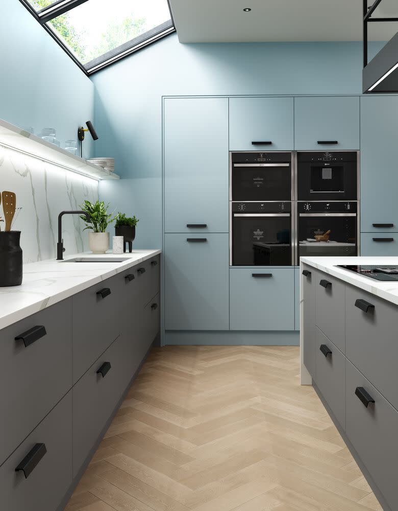
Contemporary
Pastels made contemporary in our very own House Beautiful Camberwell Kitchen at Homebase. Unexpected accents of black contrast wonderfully against this modern pastel blue, while marble countertops and pale wooden floors soften an abundance of clean lines.
Pictured: House Beautiful Camberwell Kitchen at Homebase
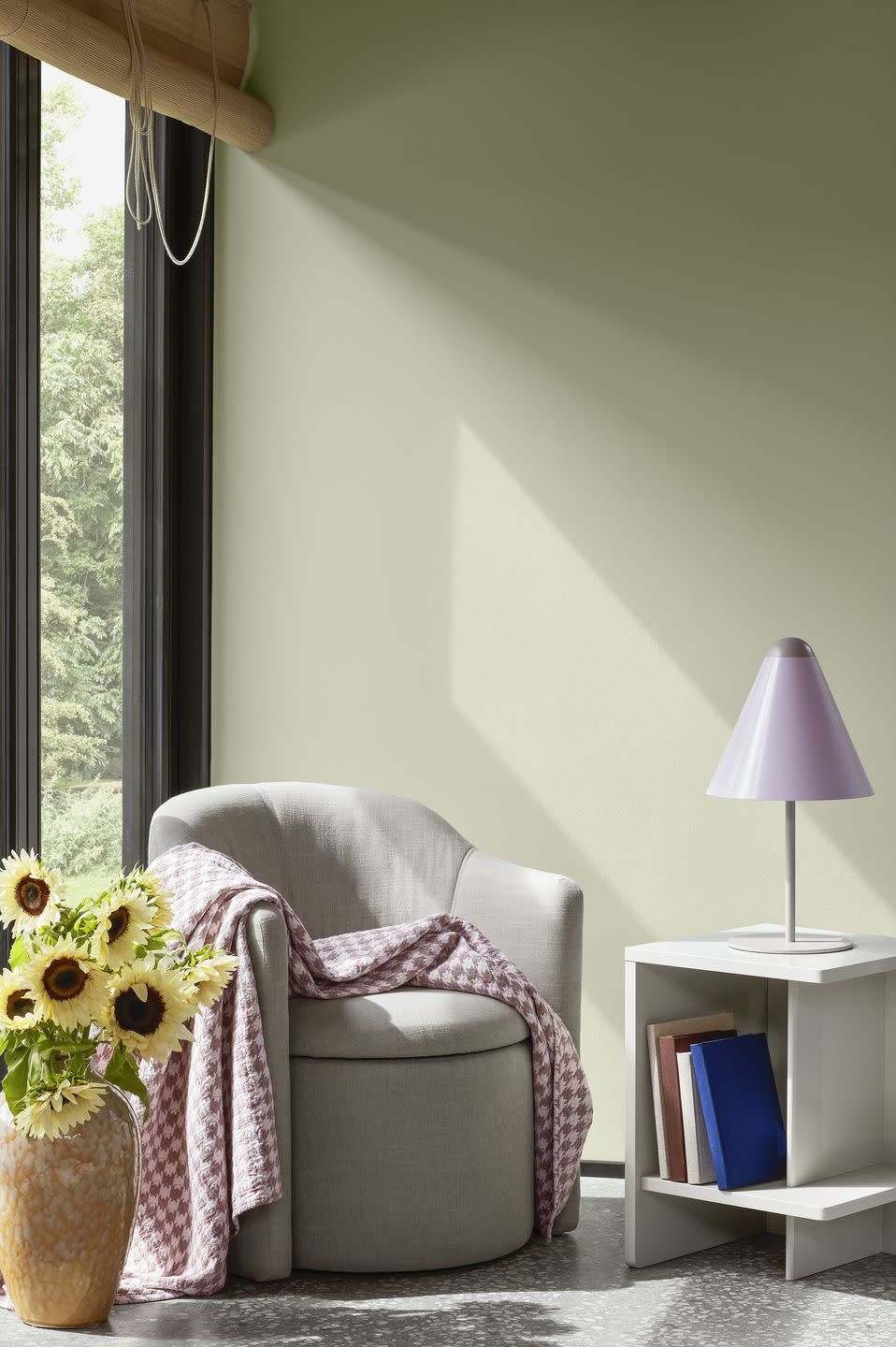
A sunny reading nook
The most peaceful corners of your home don't always have to be decorated in calming neutrals or soft whites. This sunny reading nook creates a warm welcome with buttery pastel yellows and lilacs – a brilliant backdrop too for these sunflowers to stand out.
Pictured: Pond Chair in Beige and Ingrid Vase in Camel, both Broste Copenhagen
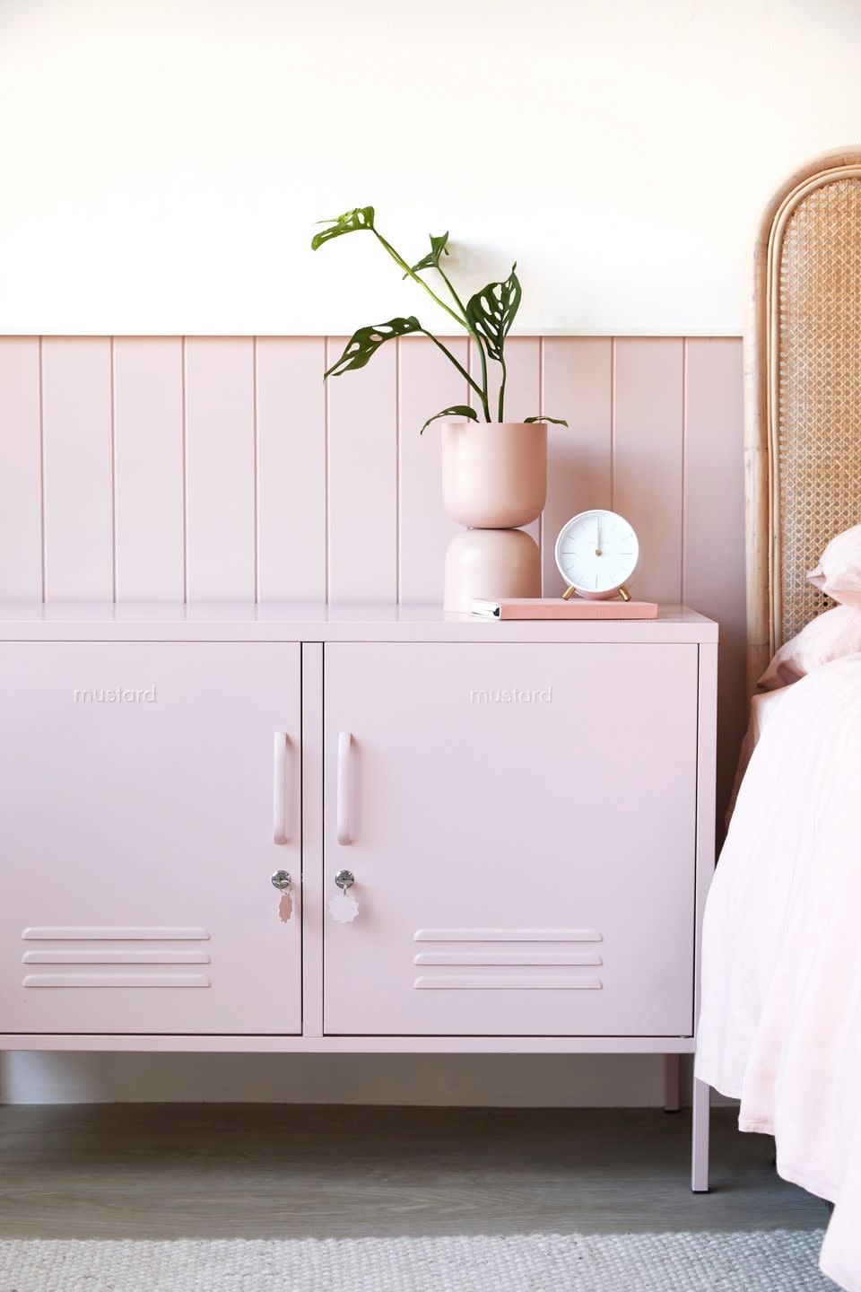
Pretty in pink
If you're going to invest in one pastel piece, we would recommend the Mustard Made lockers, available in an array of delicious pastel shades that pack a big design punch.
Pictured: Mustard Made Lowdown Blush Pink Storage Locker at Urban Outfitters
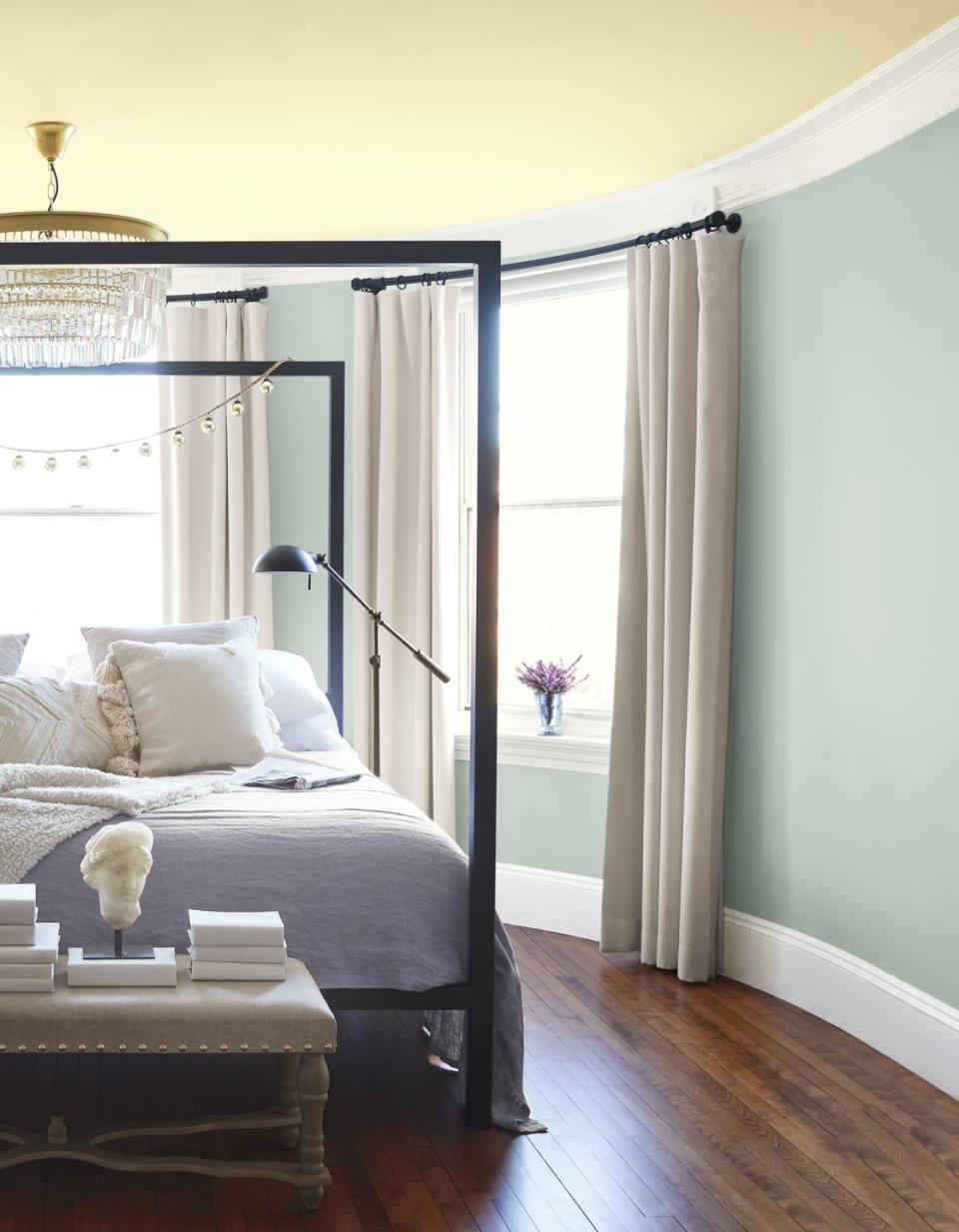
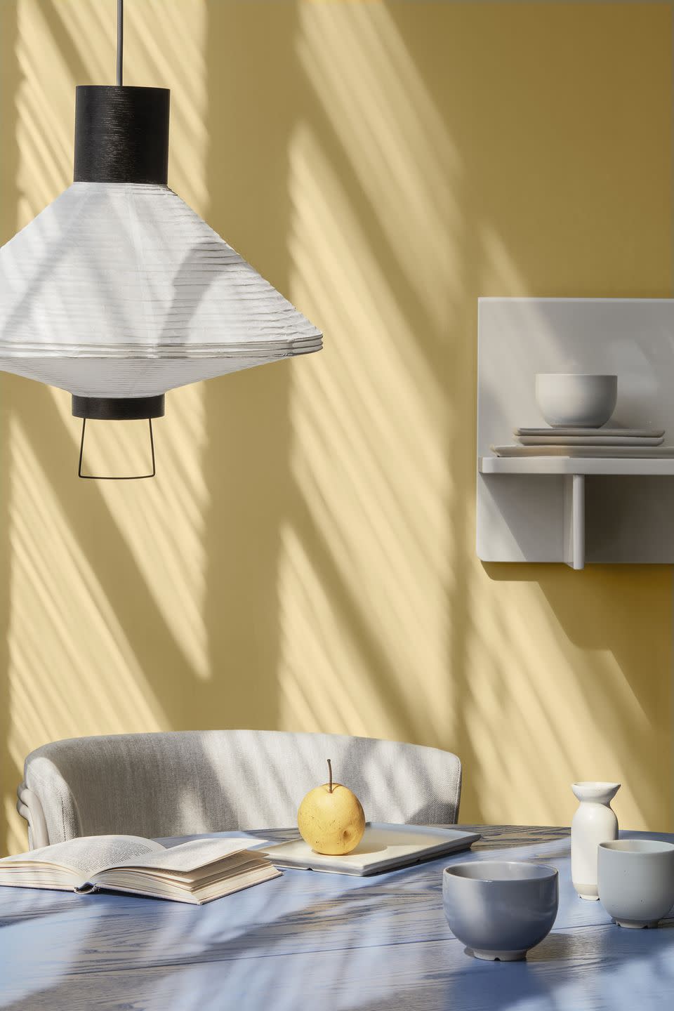
Triple-toned
This colourful bedroom provides further proof that pastels combine beautifully in design schemes. The novel use of a pale yellow shade on the ceiling is one of our favourite painting techniques – we would almost always go for pale or pastel tones when painting a ceiling to add to an illusion of light and height.
Pictured: Quiet Moments Paint at Benjamin Moore
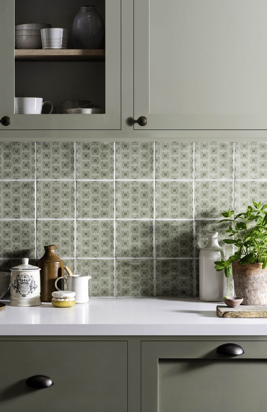
Kitchen accents
Annie Sloan uses tones of pastel pink and purple without becoming sickly sweet in this modern kitchen. The addition of wood and mottled ceramics is important in this scheme, as they offset the delicate pastel shades, offering something a touch more sophisticated. And, if you look closely, the sweet shelves are painted in graduated shades of pink – we love thoughtful details.
Pictured: Annie Sloan Antoinette Chalk Paint
How to mix
Here's a great example of how to mix pastels with their richer counterparts. The stronger the contrast, the better this colour combination works. And it will work for any pastel, so a buttercup yellow will look great with a deep ochre, and a mint with a forest green.
Pictured: House Beautiful Jay Ottoman Bed at Dreams
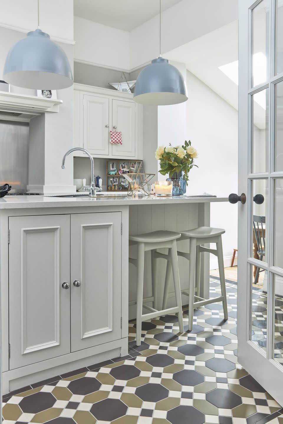
Mixed palette
A mix of pale mint green, buttery yellow, and sky blue makes this kitchen light and airy, grounded with darker colours in the tiled floor. Pastels work beautifully in rooms with plenty of natural light, and we're particularly fond of this mixed palette. Pale rose would work as a fourth shade here.
Pictured: Victorian Floor Tiles in Harrogate at Original Style
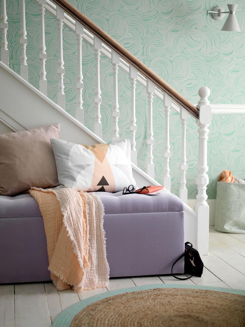
Hallway decor
If you're tentative about using pastels in your main living areas, try instead decorating a hallway, landing, or downstairs loo. Take your cue from this bright hallway scheme, and go for a pastel-toned wallpaper (we love the fresh swirling green used here, for similar try Lust Home) or some cheery accessories, like this pastel lilac ottoman.
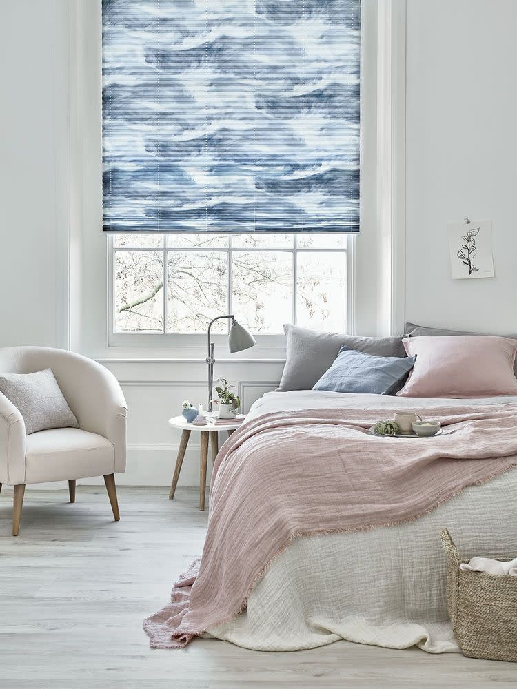
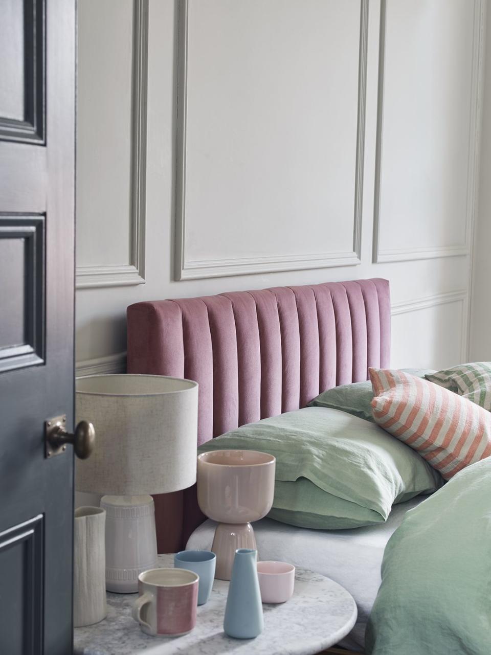
Calming and coastal
Serenity in a picture. This combination of the palest of pastel pinks and ocean-inspired blues creates a wonderfully calming bedroom sanctuary. We love the abundance of texture in soft throws, cushions, and upholstery that add to the relaxing scheme.
Pictured: House Beautiful Ripple Pleated Blinds at Hillarys
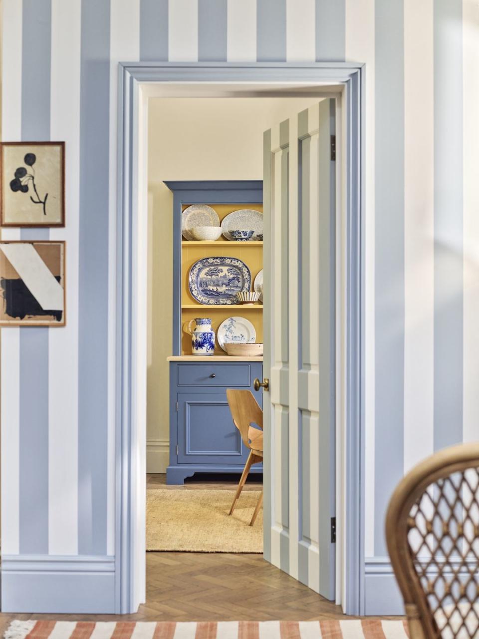
Pastel stripes
Pastels make wonderful partners to anything striped because both have similar vintage references. This playful painted doorway is reminiscent of an old sweet shop – a great idea to paint the door to match the walls too.
Pictured: Wall and door in Flax Blue and Shell eggshell, both at Neptune
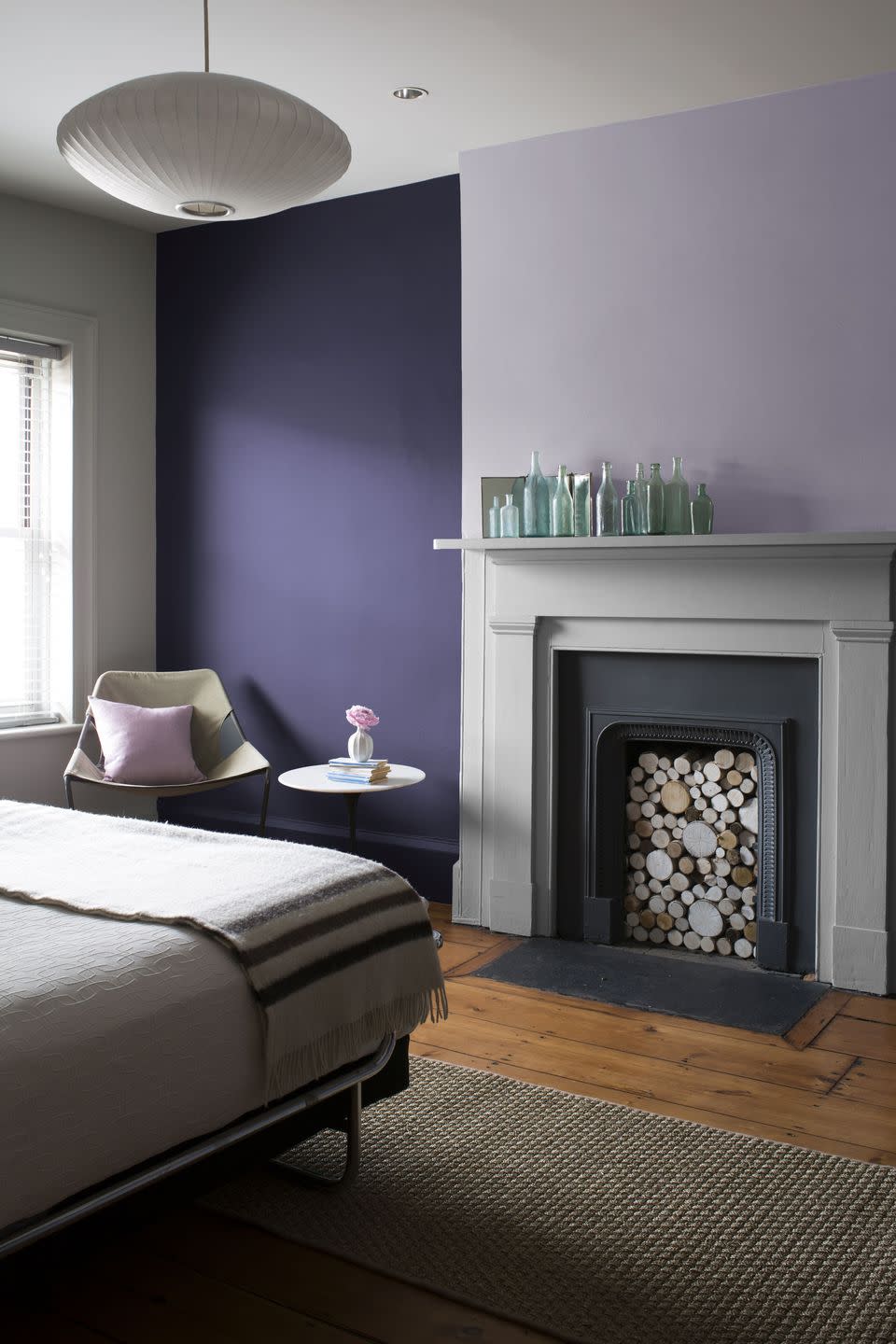
Feature walls
This pastel lilac works beautifully as a feature wall – especially with the exposed floorboards offsetting some of the chalkiness. The addition of a deep purple adds to the effect, creating something altogether more grown up.
Pictured: Lavender Mist Paint at Benjamin Moore
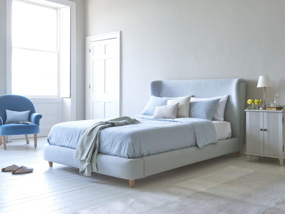
Sleep sanctuary
Blue is one of the most effective colours to use in the bedroom to encourage a good night's sleep, and a pale pastel blue even more so. This bedroom carefully layers pastel blue throws, cushions, and upholstery in ever so slightly different tones to great effect.
Pictured: Hugger Bed at Loaf
Go green
While pastels can be a very playful colour scheme to work with, they do equally well in more country-inspired and traditional settings – case in point, these pastel green painted kitchen cupboards and wall tiles from Original Style.
Pictured: Fleur Pumice Tiles at Original Style
Colour combinations
Perhaps a lesser used colour combination, but pastels will always work with a monochrome mix of black, white and grey. We love the pastel yellow wall here, that picks up natural light so beautifully, modernised with grey accessories, and a contemporary black and white light shade.
Pictured: Ritta Pendant Light Shade, Broste Copenhagen
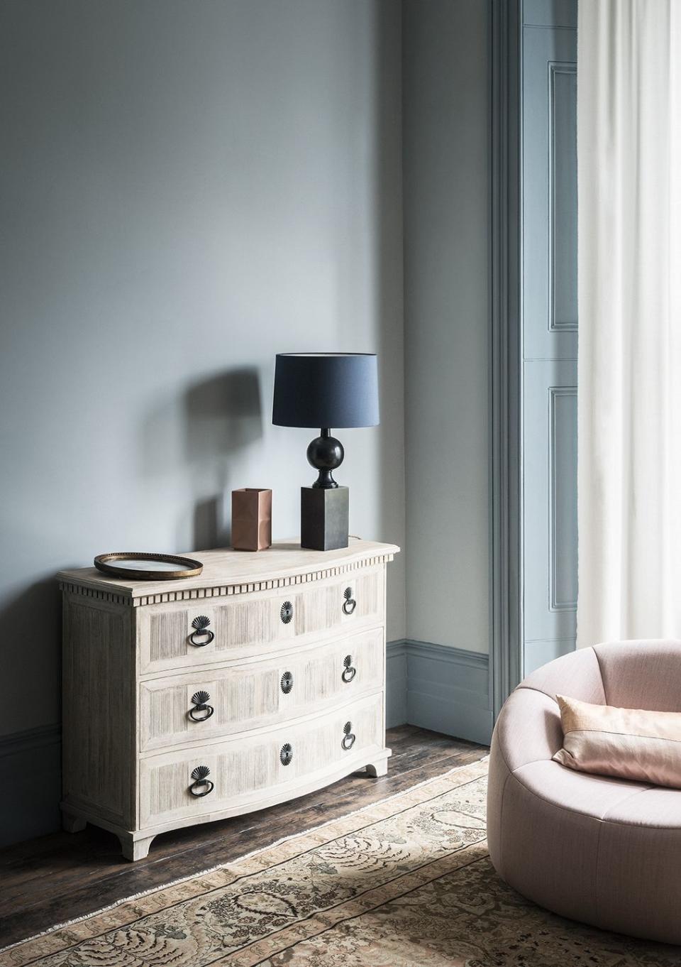
Sophisticated blues
This elegant corner belies the common design myth that pastels can't be sophisticated. The pastel blue and pink here lift and lighten the otherwise traditional features – some interesting panelling, a densely patterned rug, and classic sideboard – to create a lighter and more modern scheme.
Pictured: Bluebird Blue Paint at Paint & Paper Library
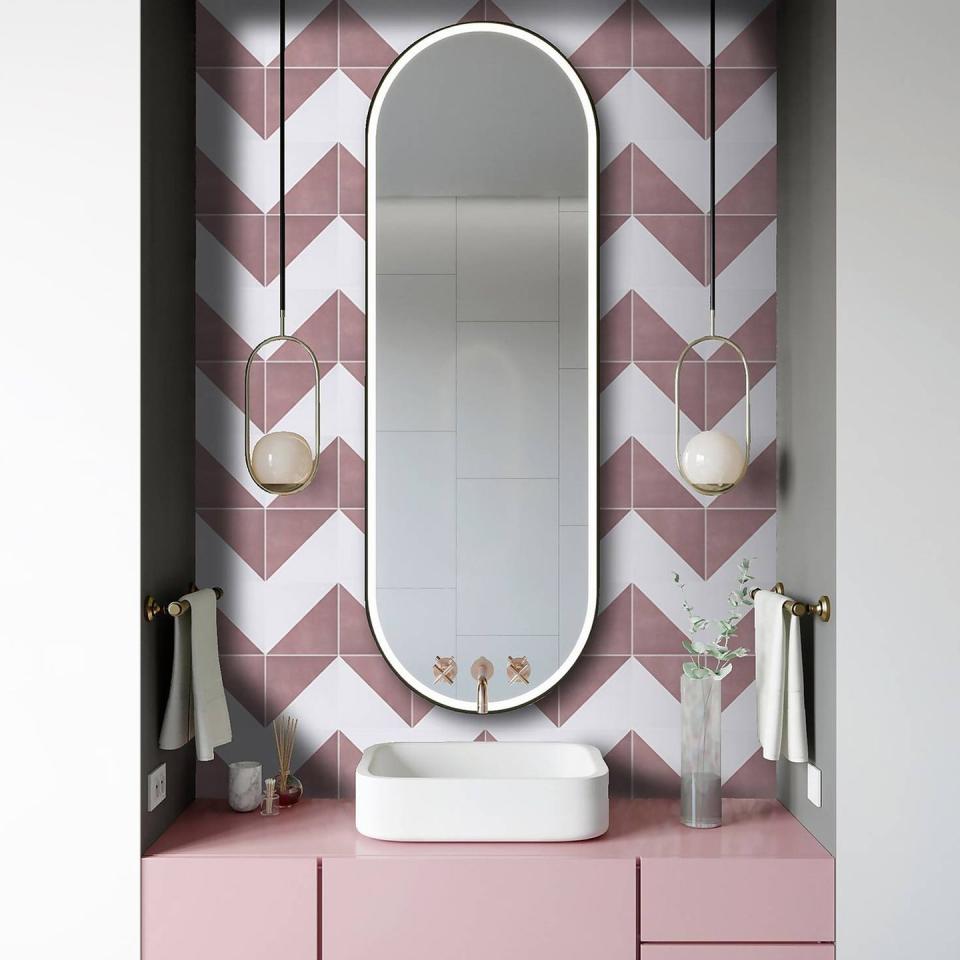
Instagrammable bathrooms
We love nothing more than an Instagrammable bathroom, and these pink geometric tiles from our House Beautiful collection at Homebase make that pretty simple. Pastel pink combined with white and a touch of brass is a classic mix for a bathroom, and will never steer you wrong.
Pictured: House Beautiful Cube Blush Porcelain Wall & Floor Tile at Homebase
All in the accessories
This is a great idea for smaller rooms that benefit from white walls to appear larger and more open. Pick up pastels in your accessories, bedlinen, blinds, and lighting, and have fun mixing shades – you don't have to exercise caution when mixing pastels because the common pale and white undertones sit happily together.
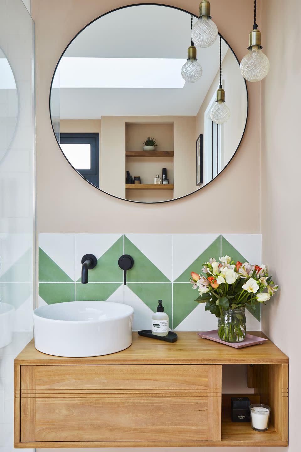
The new neutral
A lot of your standard neutral paint colours like beiges, taupes, pale greys or indeed white can be swapped for pastel shades without upgrading accompanying furniture or accessories. This bathroom could be painted in a plain neutral, or any number of pastels from this delicate pink to a buttercup yellow or a pale mint green.
Pictured: Alalpardo porcelain tiles at Bert & May
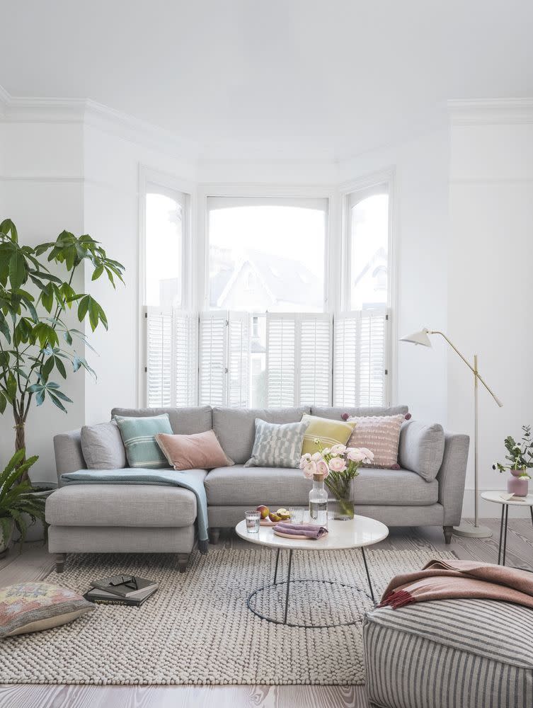
Layering
Grey and white are the perennially useful base colours from which to build, and if you can't settle on a third colour for your design scheme, consider an array of pastel tones instead. This light and airy living room layers uplifting pastel tones to create a cheerful space.
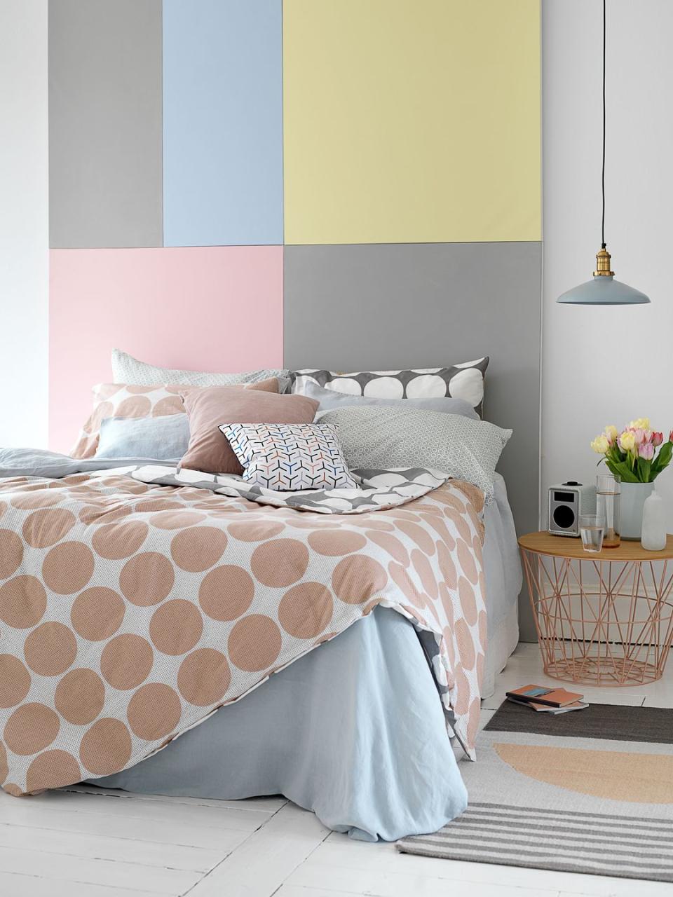
On the board
What a way to make a bed the focal point of your room. This DIY patchwork headboard is constructed with painted pastel canvases arranged into a striking colour-coordinated feature. For double the pastel hit, mix and match patterned pastel bedlinen too.
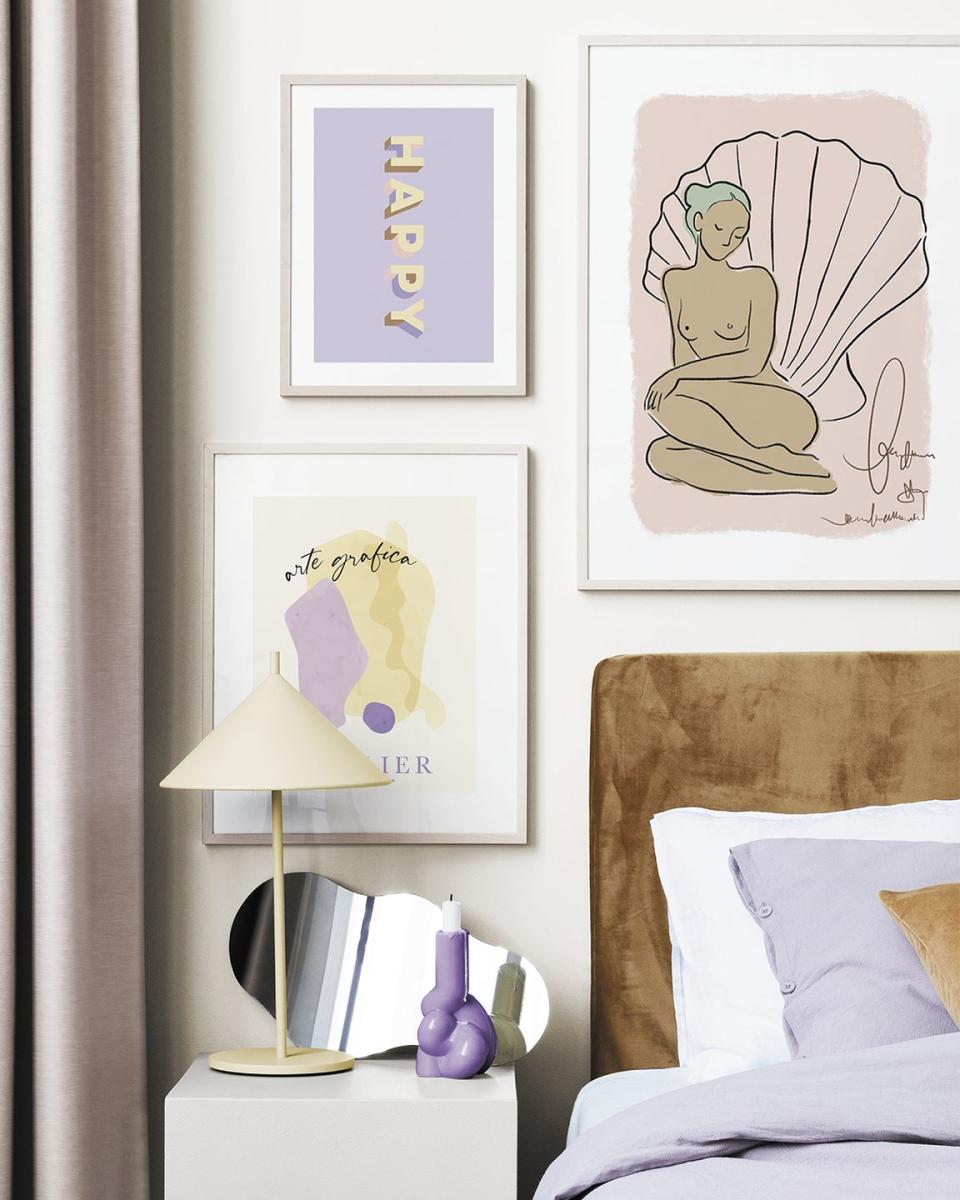
A gallery wall
Gallery walls can be tied together in a number of ways – for instance, displaying similar art styles, mounting your art prints in the same colour frames, or using wall art with similar undertones. Pastels all share pale and white tones, so a collection of pastel wall art will always create a harmonious gallery wall.
Pictured: Pastel Paradise Wall art at Desenio
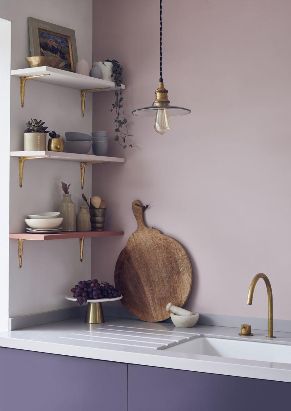
Soft tones
If you like to use brass or gold accents in your home (we love them) pick pastels that are soft and chalky, rather than sunny and bright – the latter can be a little overwhelming, and make your metallic accents appear more yellow-toned.
You Might Also Like

