
Pantone releases the top 10 colours for spring 2017
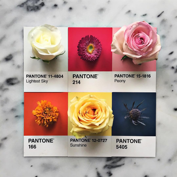

[Photo: Instagram/lucialitman]
It’s that time of the year when the almighty authority on color, Pantone, reveals next season’s hottest shades.
And with spring just around the corner (I know, fall just started, but go along with me here), Pantone enchants us with hues such as Hazelnut, Flame, Kale or Niagara.
Having nature in mind, Pantone goes from earthy, warm tones to bright and vibrant colors, taking us on a back-to-nature journey.
Executive Director of the Pantone Color Institute, Leatrice Eiseman, talks about the inspiration behind the 10 chosen colors:
“One of the things that we saw this year, was a renewed sense of imagination in which color was appearing in context that was different than the traditional… Reminiscent of the hues that surround us in nature, our Spring 2017 Fashion Color Report evokes a spectrum of emotion and feeling."
So let’s have a look at the 10 shades that will enchant us next spring, shall we?
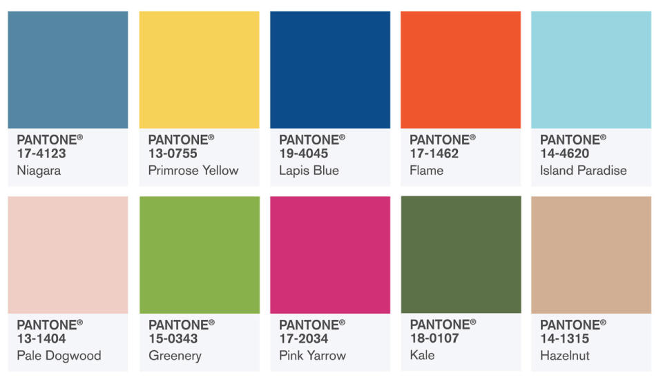
[Photo: Pantone]
PANTONE 17-4123 Niagara is the main color of Spring 2017, so expect a lot of denim-colored clothes to take over your closet!
PANTONE 13-0755 Primrose Yellow is reminiscent of sunny days and good vibes.
PANTONE 19-4045 Lapis Blue is Pantone’s way of saying ‘I’m strong, bold and confident.’
PANTONE 17-1462 Flame is feisty and will add that hot touch to the spring palette.
PANTONE 14-4620 Island Paradise is the third blue shade in the palette, a lot lighter and calmer than the previous ones. Inspires tranquillity and reminds us of blue skies.
PANTONE 13-1404 Pale Dogwood brings the same sense of calmness as the previous color. Everyone will adore the earthly soft glow of this subtle pink.
PANTONE 15-0343 Greenery is definitely in the nature zone. The tangy yellow-green inspires you to be more outdoorsy and to explore the surroundings.
PANTONE 17-2034 Pink Yarrow is bold, is festive, and it’s an eye-catching hue that gets all the senses going wild.
PANTONE 18-0107 Kale inspires a healthy lifestyle and embraces the outdoors, just like Greenery.
PANTONE 14-1315 Hazelnut is the last, but not the least. If you want to make a statement this spring, Hazelnut is the basic neutral to balance all the other colors. Warm and unpretentious, this shade is the key element in the pallet.
What do you think of Pantone’s choice? Did they kill it like they always do or would you have chosen other colors?
Interested in blogging for us? Join our Yahoo Blogger Network!

