This Kelly Wearstler–Designed Boutique Is the Very Essence of California Dreamy
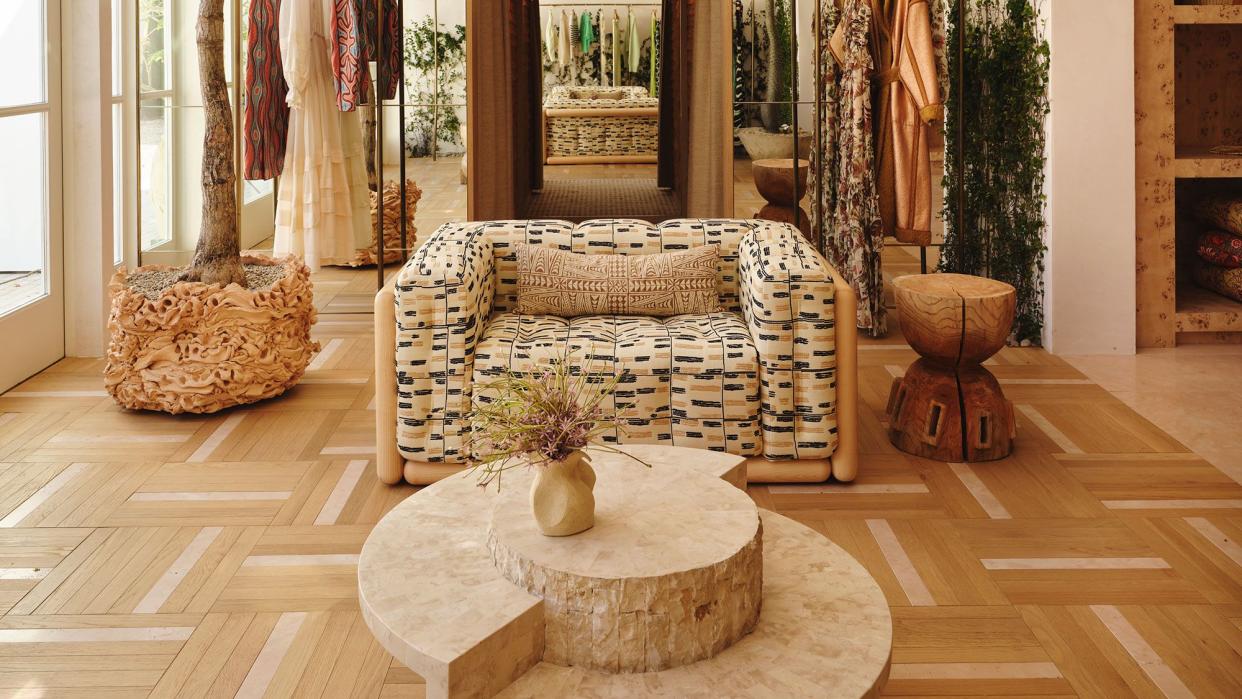
Ruffles, frills, flounces. It’s all in the vocabulary of Ulla Johnson’s romantic-with-an-edge garments, or “lovelies,” as they are often referred to on the Brooklyn-based fashion designer’s website.
Johnson has added yet another lovely to her line sheet—a sun-drenched Los Angeles store designed by ELLE DECOR A-List Titan Kelly Wearstler. The store, located on Beverly Boulevard, is a uniquely Los Angeles wonderland, with a solarium, a lush garden terrace, and even a towering indoor Brachychiton tree. In typical Wearstlerian form, it’s a place where succumbing to the fantasy is all too easy. But that’s the aim: “It truly feels like you could just spend the day there,” the designer says.
Though Johnson and Wearstler feel like perfect creative partners—with their globetrotting sensibilities and innate senses of cool—the pair’s paths had never crossed. “We have some mutual friends, but I had never met her in person,” Wearstler says. “She reached out about designing her L.A. flagship, and we had a great connection.”
The duo discovered a mutual love of artisans, travel, and art (Johnson’s parents were archaeologists), and a project was born. And though the designer had two New York stores, one in Manhattan and one in Amagansett, “she wanted this one to feel a little different, more residential,” the designer says. “Like, you want to hang out and be able to spend a few hours there.”
Accessories Area
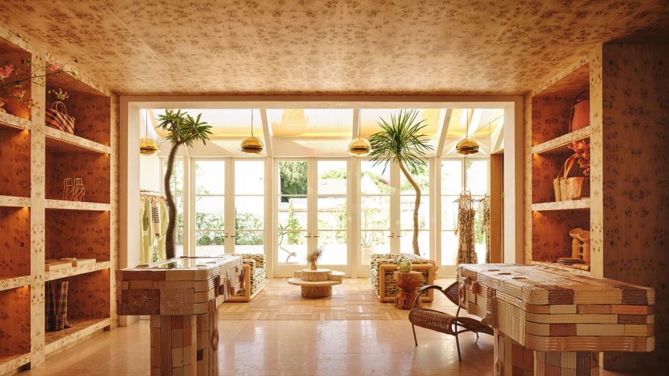
Accessories like handbags and jewelry are displayed in an enveloping ground-floor space adjacent to the primary salon.” We found this really beautiful burl timber that skims the wall and the shelving,” Wearstler explains. “It’s like this vestibule that brings you from the main salon out to the exterior.”
Accessories Area
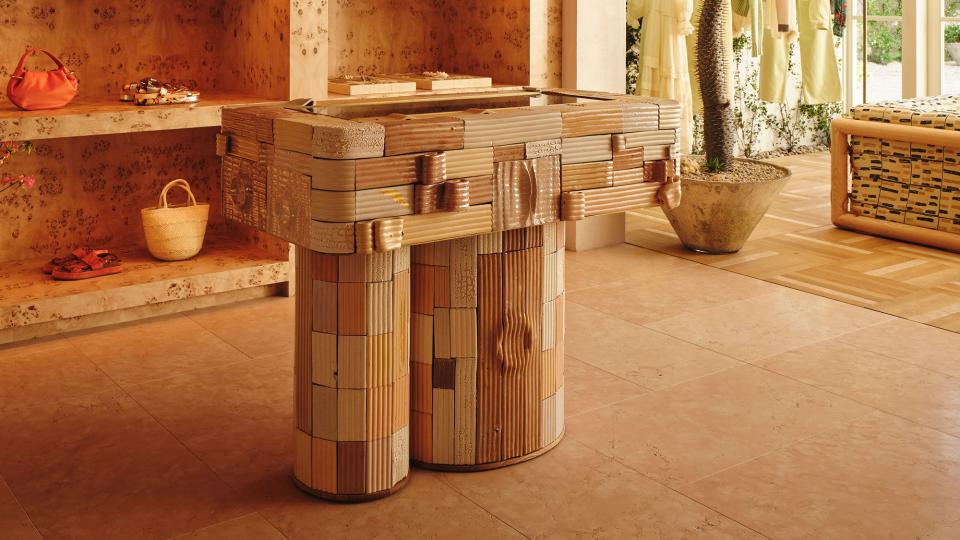
Because texture and pattern are so integral to Ulla Johnson’s fashions, Wearstler and her team incorporated those attributes into the boutique wherever possible. An intriguing jewelry case, designed by Canadian artist Jeff Martin, features peeling, grooved ceramic tiles that give the furnishings’ surface the quality of ribbon and tree bark alike.
Jewelry Display
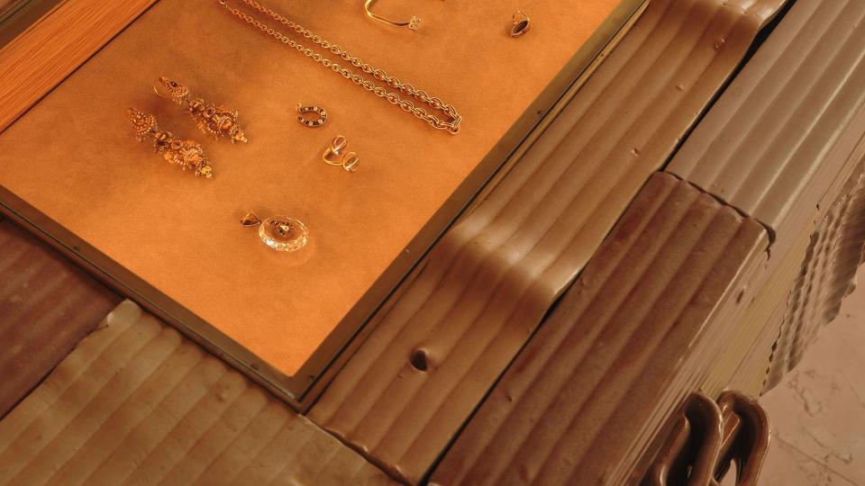
A closer look at the display cabinet, which showcase’s Ulla Johnson’s collaboration with New York jewelry company Kentshire.
Solarium

Wearstler and her team opted to add a solarium to the shop’s rear, a move that infuses the spaces with soft Los Angeles sunlight. This airy salon features vintage chairs designed by Venetian architect Carlo Scarpa and pendant lights designed by his son, Tobia Scarpa, with his wife, Afra, among other curated objects and accessories. But one of the room’s most unusual attributes is its parquet floor, which is made up of a combination of oak and stone strips. “We were figuring out if we should do a timber floor or something in stone, but we ended up meeting in the middle and did a combination,” Wearstler says.
Dressing Room
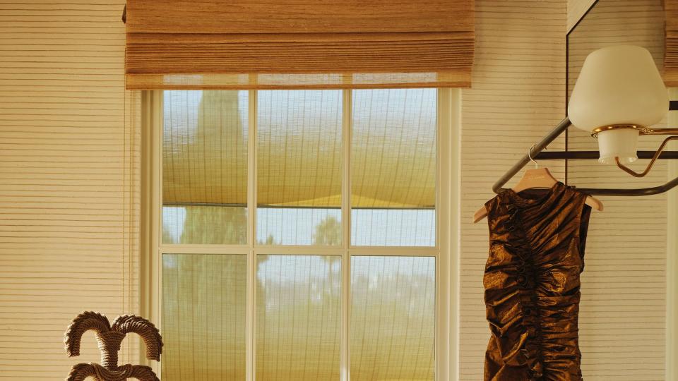
Plaster, one of Wearstler’s favored materials, makes appearances throughout the boutique, including in this changing room. Here, the tactile, combed plaster walls were designed by Studio 1 Plaster. The chair is by Christian Astuguevieille, the vintage sconce is by Gunnar Asplund, the side table is by Daniel Orozco, and the ruched dress is by Ulla Johnson.
“There’s always a hierarchy in design,” Wearstler adds. “So the hierarchy here is setting the stage for fashion. And then everything else follows suit.”
Bathroom
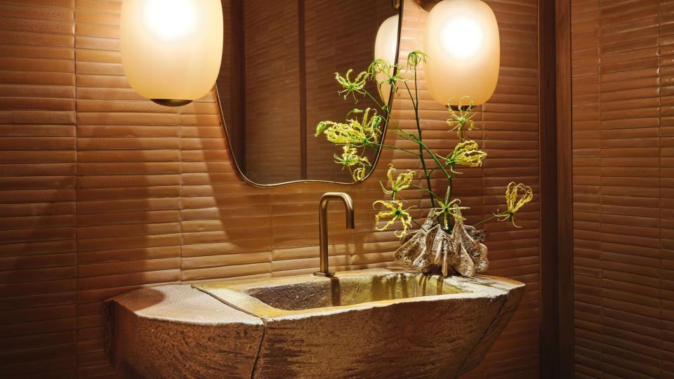
Every space was considered with a residential scale and vibe in mind. This bathroom is clad in custom Bantam tiles. Glowing Barovier & Toso sconces frame a vintage Italian mirror and a custom organic sink by Jonathan Cross.
Stairway to Mezzanine

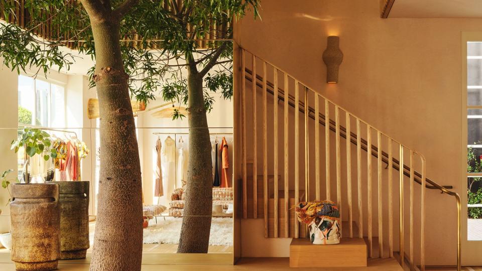
The original building was two stories but, to heighten the connection between indoors and out, Wearstler’s team punched out part of it to create a mezzanine. “We felt that to add this magic to the space, we wanted to forgo some of the upstairs square footage and have this really open air space,” the designer explains.
It also provided an opportunity to install a double-height Brachychiton tree, which lends a Suessian twist to its elegant surroundings. “We actually have it in our Malibu house, and it’s just as magical,” Wearstler adds. “That’s the beauty of California, bringing the outside in and vice versa.”
Second-Floor Lounge
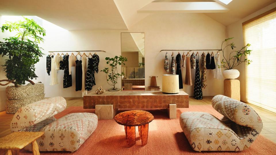
Wearstler wanted to create spaces where shoppers could simply hang out and relax while perusing Johnson’s pretty garments. In this lounge, a pair of low-slung vintage lounge chairs by Joe Colombo beckons visitors to take a load off.
Second-Floor Lounge
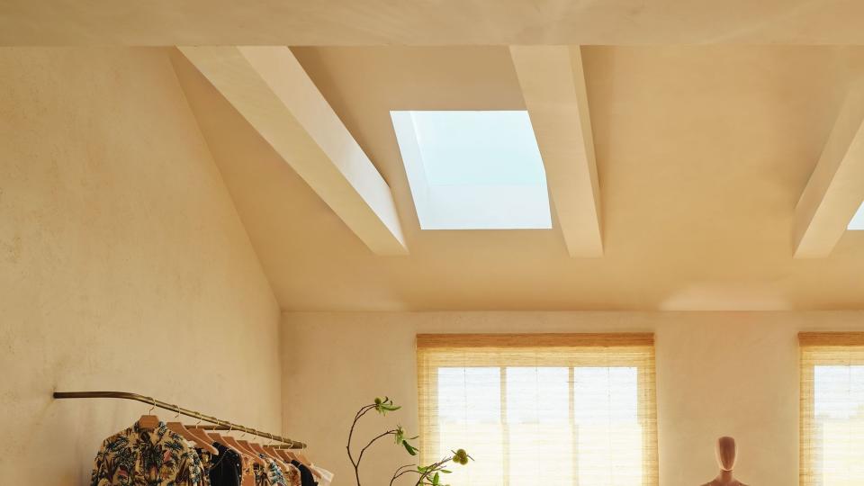
Additional skylights illuminate the lounge. A custom console table of Wearstler’s own design displays a vintage Gianfranco Frattini lamp. The chair (left) is from the 1980s.
Lounge
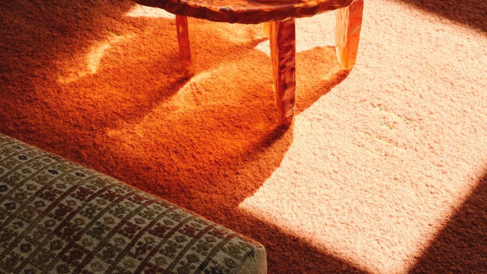
The custom Ross Hansen table glows orange in the sunlight.
Dressing Room
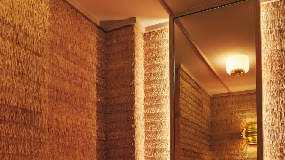
In one of the store’s more surprising moments, a dressing room is swathed entirely in a fringed raffia wallcovering from CMO Paris. Wearstler designed the bench cushion, which is upholstered in a vintage African runner from Jamal’s Rug Collection.
Wearstler wanted to nod to Johnson’s aesthetic—which melds billowing silhouettes with batiks and block prints—but filter it through a distinctly Angeleno lens. “Ulla’s clothing has a lot of texture and pattern. And so we wanted the space to also be about texture and color,” Wearstler says. “Our clients are our muse.”
First, Wearstler and her team needed to address the store’s architecture. “It was in an existing building that hadn’t been touched in probably 20 years,” explains Wearstler, whose firm is now beginning to tackle architectural scope. “So we really opened it up. There’s so much beautiful, natural light, and we wanted to make it a simple and architectural box.”

With the architecture clarified, Wearstler and her team got to work crafting a retail paradise. The experience is built around the idea of entering a living room. Two sun-drenched, ground-floor salons feature comfy-looking sofas and armchairs (including a set designed by Italian modernist Carlos Scarpa) that practically beg worn-out shoppers to take a load off. The welcoming, light-washed rooms—complete with twisting indoor trees, thick carpets, and featherlight racks of garments—make it feel like you’re entering a stylish friend’s walk-in closet. “You feel like you’re in somebody’s house,” adds the designer.
From there, shoppers can peruse handbags and jewelry in a suitably jewel-box-like chamber, which is clad entirely in speckled burl wood. A set of intriguing console tables, designed by Canadian artist Jeff Martin, is covered in peeling ceramic tiles that give the furnishings’ surface the quality of unfurled ribbon and tree bark alike.

“By then they’ve collected some clothing,” Wearstler observes, and shoppers can float up a narrow set of brass-detailed stairs to discover more lovelies or relax in a second-level lounge. “All of the rooms have their own storytelling,” the designer explains. “When you walk into a store, you don’t give it away all at one time.”
One of the store’s most special spaces is a back terrace designed by New York landscape designer Miranda Brooks. Here, visitors can step onto the patio and catch some rays amid colossal pots planted with desert trees and shrubs. “That’s the beauty of California,” Wearstler says, “bringing the outside in and vice versa.”
There’s certainly one happy customer. Johnson, on the eve of a celebratory dinner in the garden last month, posted a selfie from a fitting room: “Surrounded by so much beauty. This store was built with endless love and care and decorated as I would my home.”
You Might Also Like


