
Are your walls 2020 enough? Find out, with our edit of the latest paint collections

Which new paint shades are hot right now? Have we reached peak grey? Can you mix pink with green and make it work? Jessica Doyle looks at the latest trends
Dulux named its Colour of the Year for 2020 last week – a pale green that it has called Tranquil Dawn.
This annual announcement reflects what the brand’s trendspotters predict will be increasingly popular, based on analysis of the fashion, art and design scene, as well as what is going on in the wider world; they believe the soothing quality of this shade is what is needed currently.
This is also the time of year when paint brands reveal their new colour collections, and there’s plenty to choose from, from dark, dramatic shades to rainbow brights. Here’s our pick of the best palettes, and the new ways to use them.
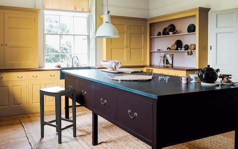
Cabinet policy

Kitchen company Plain English has just launched a new collection of colours – for only the third time in the company’s 27-year history – in collaboration with interior designer Rita Konig.
The range confirms a growing trend for bold-coloured kitchens, and the names chosen for the shades refer to traditional British foodstuffs – Flummery, Candied Peel and Burnt Toast, for example.
Try using a combination of contrasting shades – a good trick for making each colour pop. Konig suggests thinking about colours in groups of three – one for low cabinets or islands, one for high cabinets, and one for walls.
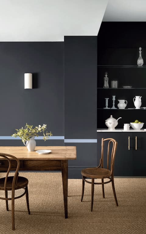
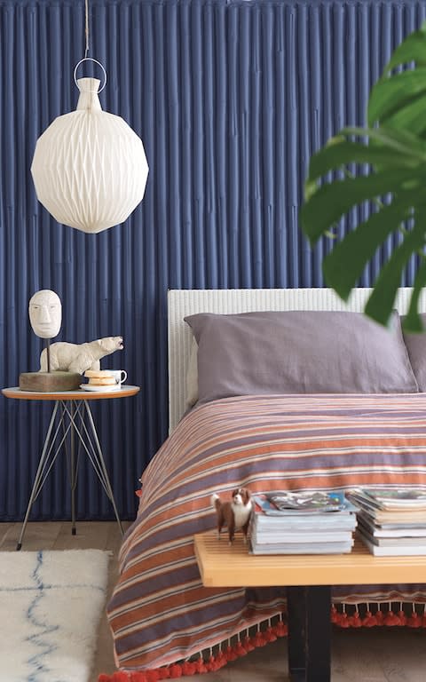
Ink incorporated
A dark, inky wall certainly makes a dramatic statement, and looks beautiful with wooden furniture and greenery. If you’re worried it will be overwhelming, try adding a narrow stripe in a contrasting colour at dado height to lighten the mood.
The colours here are Beyond Blue and Blue Vein, both new from Paint & Paper Library.
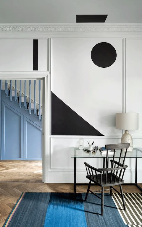
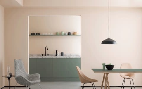
In another room (below), the same dark blue has been used to paint a graphic shape on the wall. Its clean edges require patience, preparation and a good deal of masking tape, but the effect is striking, and it works well to delineate the little desk area.
Note how the staircase in the hallway beyond has been painted in the complementary paler tone, so that the two areas work together.
Back to the feature
Farrow & Ball has worked with the Natural History Museum on its new range of 16 colours inspired by nature.
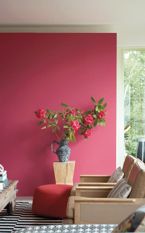
Lake Red and Imperial Purple are both strong shades that might overpower if used on all four walls of a room, but work well used only on one, to help zone a space.
Bathe in colour
Coloured baths have become a hot trend in bathroom design, and are a good way of adding character to what can be a sterile-looking space – but they’re usually expensive.

Painting your existing bath is affordable, and not hard to do. This bath is painted in Annie Sloan Scandinavian Pink Chalk Paint, which doesn’t require a primer and can be painted on to pretty much any surface.
Adjust the contrast
Green and pink has been one of the most fashionable colour combinations over the past couple of years, but it can look a little garish.
Here’s how to do it in a soft, neutral way, with palest rose pink and sage green – Peach Baby and Sunday Stroll, both from the range of eco-friendly, plastic-free paints by Earthborn.
The kitchen above demonstrates how combining contrasting tones of a similar colour can create a beautifully harmonious effect.
