
Viva Magenta! What Pantone’s colour of the year tells us about 2023

It exists between blue and red, warm and cool, to be found on a spectrum all its own. It is 150 years old yet still future-facing, at once digital and primordial. It is – to quote its creators – “brave, fearless and pulsating”. It is Viva Magenta, Pantone’s colour of 2023.
If you’ve never heard of this colour, that’s quite deliberate. For almost 25 years, the colour-matching company has tasked itself with choosing a shade that – according to its extensive cross-disciplinary analysis of prominent hues within art, fashion, design and beyond – not simply captures the zeitgeist, but sets the tone for the year to come.
After 2020’s muted evening blue, the 2021 joint winner of pebble grey and hazard-warning yellow, and this year’s bright periwinkle hue, Pantone have settled on this “audacious” shade of carmine red for 2023.
“It’s brave, it’s fearless, it depicts optimism and joy – and we know that we are all greatly in need of that,” says Leatrice Eiseman, executive director of the Pantone Color Institute.
Related: Ultimate Grey and Illuminating: Pantone’s 2021 colours of the year spark hope and despair
In popular culture at least, shades of magenta are everywhere, from the signature berry-coloured smokey-eye makeup of Charlize Theron’s Marvel heroine Clea, to Emily Blunt’s plum-coloured aristocratic-western getup in The English.
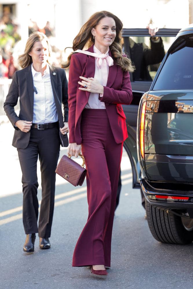
Harry Styles – ever at the vanguard of fashion – chose a Gucci magenta blazer to announce his arrival in Venice for the premiere of Don’t Worry Darling, while, just last week, the Princess of Wales wore an Emilia Wickstead coat dress and matching hat in this jewel tone to receive South Africa’s President Ramaphosa.
It’s not the easiest colour to wear but it can send a message. See Lewis Hamilton’s defiant layering of the shade after his outburst at the Dutch Grand Prix. The US paint company Benjamin Moore earlier forecast the return of red interior walls, naming the similar – but even more striking – “Raspberry Crush” as its own colour of the year.
Ever since its inaugural selection of cerulean for the new millennium in 2000, Pantone’s colour of the year has been a conversation starter – and a prompt to reflect on this current moment. But the company has greater ambitions than identifying trends.
As we stare down 2023, we are no longer reeling from the shock of the coronavirus pandemic; instead, Pantone suggests, we are turned towards the future. Laurie Pressman, Pantone’s vice president, says Viva Magenta represents a prevailing desire for optimism, resilience, outside-the-box thinking and technological innovation so as to create a better world.
“We’re living in a time where so many people have been aggressive; that’s what’s needed to go forward,” she says. “We need courage, bravery, but we’re looking for something that promotes joy and is fun. Life right now is unconventional and challenging in many ways – I think we’re looking for things that help us escape.”
If it seems like purple prose, it is worth remembering that colour is central to the human experience as a means of storytelling, communication and connection, points out James Fox, the Cambridge art historian and author of The World According to Colour.
“It seems like a good and apposite choice for a period when everything feels very grey, dark and murky, and lots of people have lost hope. Essentially it’s a colour about the resilience of the human spirit.”
For all its unnatural, even digital-seeming appearance, magenta is evocative of clays, cave paintings, even the colours of the galaxy; the earliest plant life on Earth, predating chlorophyll, was believed to be a similar purplish shade. “It’s this colour that kind of fizzes on the retina, that vibrates – you can’t quite pin it down,” says Fox.
Indeed, he says, magenta is a manmade “concoction” that emerged in the mid-19th century following the serendipitous invention of mauveine, the first synthetic aniline dye. Its huge commercial success inspired others in Europe to chase after more.
In 1859, after concurrent discoveries by chemists in France and south London, a reddish-purple dye started to be produced on both sides of the Channel as “fuchsine” or “roseine”.
It was renamed the following year for the battle fought by France and Sardinia against Austria in the town of Magenta, Lombardy – not for soldiers’ bloody uniforms, as is often thought, but in a show of solidarity with Italy, fighting for its independence.
Fox makes a parallel with the Ukraine war today. “A year ago, many people had never heard of Mariupol; now it is not only a household name, it’s associated with a cause that most people feel strongly about.
“Just as most British people support Ukraine in its battle today, in the 19th century most supported the Italian war of independence … The moment magenta emerged from was in some ways similar to our own.”
But its resurrection may be a shock to the system in the modern world of 50 shades of grey. After the sunny Mediterranean shades of the 90s, the prevailing interior design trend of the past 15 years has been “greige”.
Ikea, Apple and others have likewise exported and extended their monochrome, minimalist aesthetic globally. Even films and television are increasingly desaturated, leading some to suggest – as in a viral TikTok from August – that “colour is disappearing from the world”.
Those that have managed to assert themselves, against this muted backdrop, have had to shout: think the highlighter-yellow messaging through the pandemic, or the flaming Maga-hat red.
Magenta, straddling the line between red and blue, is not only apolitical; it is essentially unifying, says Fox. Partly ultraviolet, partly infrared, it “doesn’t exist on the spectrum … but it somehow encapsulates the whole range of colours that we can see – and also some that we can’t.”
It might make Viva Magenta Pantone’s most self-referential colour of the year yet: slippery yet undeniable, just like the passage of time, and its corresponding shades. “How do you ignore this colour?” says Eiseman. “You can’t.”

