
How I gave my home a designer look on a budget
As an architect and landscape designer with a little black book of high-end clients, Ruth Campbell is accustomed to managing projects with sky-high budgets. But when it came to her own family home in south-east London, she needed to be especially clever and thoughtful with her designs in order to get the look she wanted without spending a fortune.
When they bought the 1930s house 11 years ago, Campbell and her husband (who is also an architect) had two children, aged two and one, and their third child arrived not long after they moved in. Although they had originally considered extending at the rear, they realised that, with four separate rooms on the ground floor, they didn’t need more space, just a more open layout.
“For us, the garden was really important, and it was one of the main reasons we bought the house, as it backs on to a nature trail,” says Campbell. “To lose any of it would have been for internal space, which we didn’t really need. The house just needed to be reconfigured to bring more of a feeling of space inside, maximise the view, and give better access into the garden.”

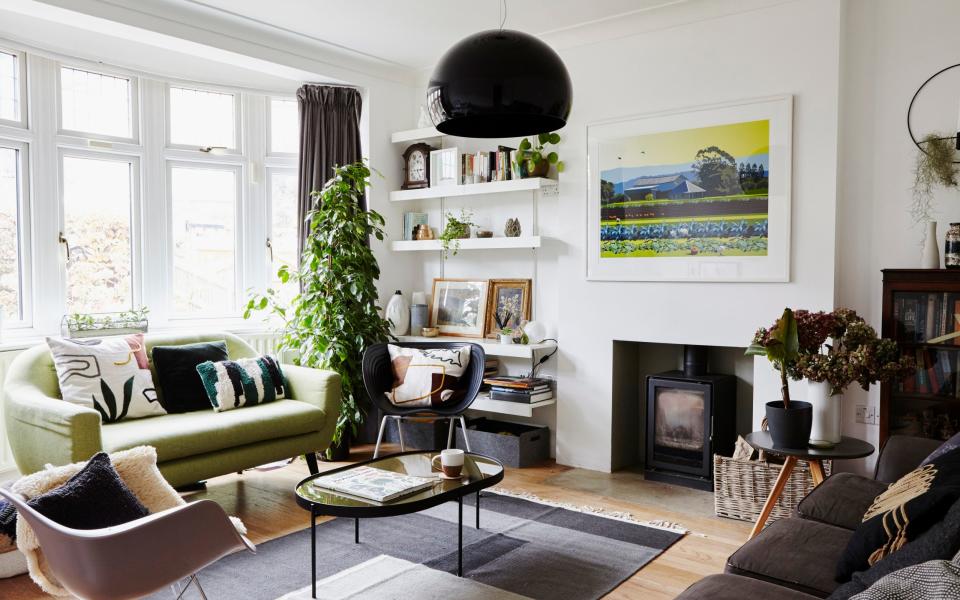
They decided to knock through the two rooms at the back of the house to create a wide kitchen/dining room, with full-height sliding doors that give sweeping views of the surrounding trees and open on to a terrace. At the front of the house, there is a family room/study that leads off the kitchen on one side, and a self-contained sitting room on the other, so that all the family have somewhere they can gather together, but also separate spaces when needed.
The structural work took up the majority of their budget, so when it came to the interior fittings, they economised with an Ikea kitchen: “It meant we’d be able to get it done and move in quicker, which was really important,” says Campbell.
Since then, however, the house has evolved to suit the changing needs of the family, and also to give Campbell the opportunity to shape it into the home that she wanted.
“As architects, we are constantly surrounded by beautiful projects, which are beyond our price range,” she says. “A lot of the work took some time to get completed – the garden even more so – to ensure that we were able to achieve the higher-end finish that we wanted.”
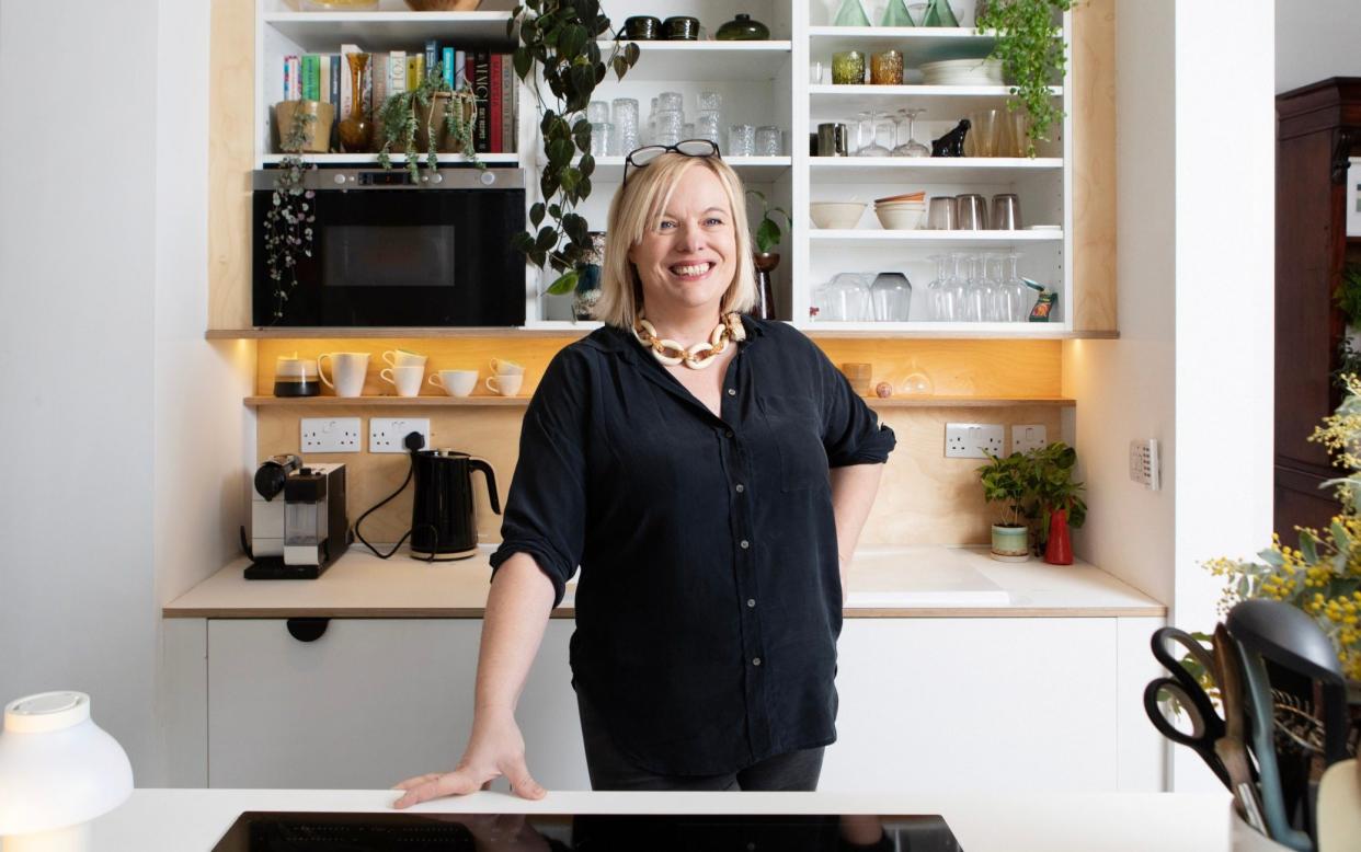
For example, just over three years ago, they decided to give a little TLC to the kitchen, which had started to look tired after eight years of busy family life: “It was fine, but some of the doors had got really tatty, and the handles we’d chosen had started to chip, so they’d not done brilliantly,” says Campbell.
Luckily, they’d had the foresight to buy and store a set of replacement doors several years before, when they discovered that Ikea was discontinuing the kitchen: “It saved us a huge amount of money, because to get new doors made bespoke to fit the old cabinets would have cost four times the price,” notes Campbell.
To give the kitchen a bespoke finish, she designed plywood elements, which were installed by a joiner, such as the trim surrounding the cabinets above the sink (from which she removed the doors entirely so that they now work as open shelving for her collection of crockery, cookbooks and vintage glass), as well as the lacquered-plywood splashback with a neat little integrated shelf, and matching kickboards.
The old fridge was replaced by a slightly smaller one, which allowed room for a run of built-in ply cupboards above, and a clever, slimline pull-out pantry cupboard to the left of the fridge, which takes up very little space but provides ample storage for herbs, spices and other dry goods.
Finishing touches to the kitchen include the worktops, which she replaced with Fenix, a high-tech surface material that is resistant to scratches and stains, feels softer to the touch than formica and is cheaper than stone, as well as new cabinet handles and drawer pulls from Dowsing & Reynolds (a quick way to spruce up inexpensive cabinet doors).

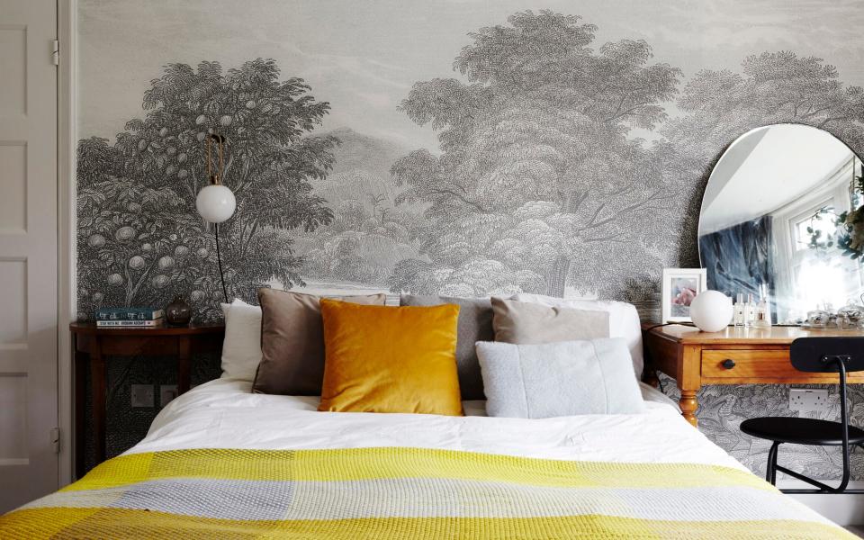
Elsewhere in the house, she added a designer look to the bedroom in the form of a monochrome wallpaper mural depicting trees and birds. “We had done a couple of houses where we’d installed a mural by the French company Zuber, which makes the most amazing wallpapers, but they were well beyond our budget,” she says. “Then I found this one [called Land of Milk & Honey, from £155 a square metre] from Woodchip & Magnolia, which was perfect. We’ve used its murals on a couple of projects since. They just add that slightly different element, and they’re like works of art.”
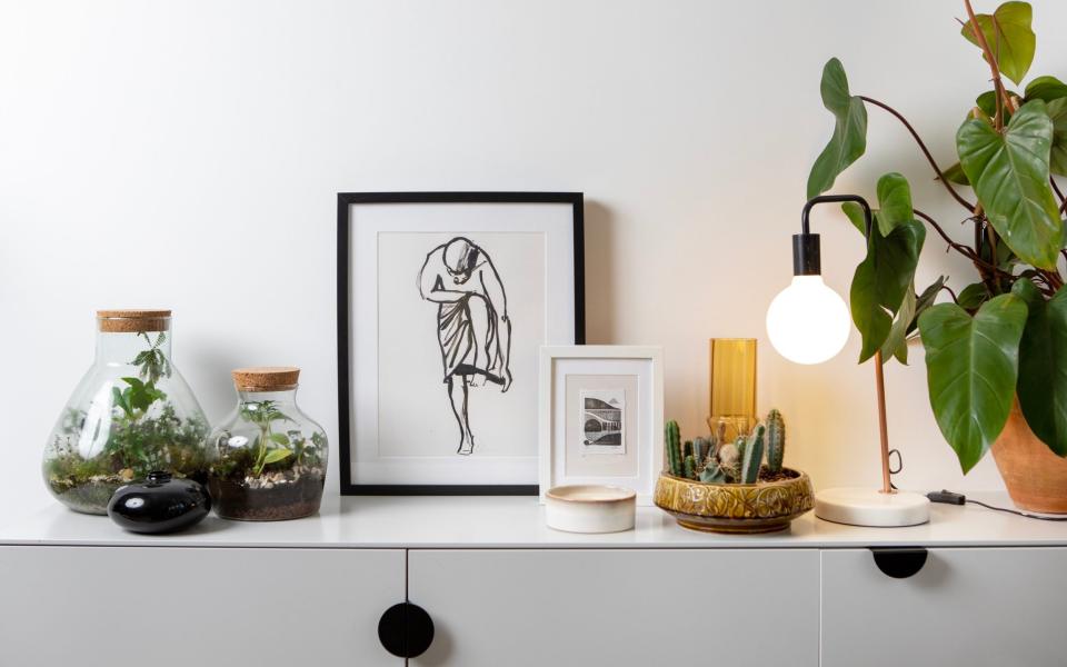
Other works of art came in the form of paintings and prints bought from local artists to give the house a sense of place and character, as do the antique cocktail trolley and dresser in the dining room, which came from her husband’s parents’ house. “The dresser had glass doors, which made it a bit too formal for us, so we took those off,” she says. “It’s worth remembering that you don’t have to keep antique pieces exactly as they are; although I wouldn’t paint brown furniture because in my opinion it does ruin it, and then when the paint starts to look tatty people often just throw the piece away.”
When it came to lighting, another key element of any designer interior, she mixed high-end with high street to give a stylish look, while keeping the budget under control. “I do think it’s worth spending on good lighting,” says Campbell, who invested in the glass sphere pendant light and table lamp in the kitchen, from Artemide, but then bought less expensive lights in a similar style from shops such as Wayfair for the rest of the house to carry the theme through.
She also replaced the kitchen spotlights with scooped, plastered-in ones: “They’re so much nicer than a standard spot, and they only cost a tiny bit more,” she says. “We didn’t have to take down the ceiling to put them in, we were able to retrofit them easily – and they make a massive difference to how the room feels.”
Through this combination of elevating inexpensive pieces with bespoke elements, shopping around for beautiful but budget-friendly things, and building on what was already there, she has created a thoughtful and functional interior that can withstand the pressures of family life, while still delivering an aesthetic that makes her happy. Proof that a well-designed home needn’t break the bank.
Ruth Campbell’s budget tips for getting a high-end look
I’m a fan of a white wall. Much of the house is painted brilliant white, as it goes with everything, which helps tie a room together if you have a mix of antiques and modern pieces. It’s also quick and easy to touch it up, in a way that coloured paint isn’t. We are outdoorsy people so the walls often get a bit grubby, but a couple of hours with a roller and it looks really fresh again, and the whole room looks more finished.
“Brown” furniture is an inexpensive way to get a classic look, and it doesn’t have to look old-fashioned. A lot of our super-high-end clients have these pieces, which they have often inherited, but the way they mix them with more contemporary designs works really well and adds to an elevated look. If something has a bit of age to it, it gives a room more substance. Such pieces have a naturally timeless look, so you can change the room around them and they will still fit in – and if they have the odd mark or scuff it doesn’t really matter, whereas if you buy something new and fancy and someone spills something on it, it’s ruined.
To get a more high-end look, don’t have all your lighting in the middle of the room. Put lamps in corners, rather than relying on central ceiling lights. Having all your lamps on a five-amp circuit is perfect as you can turn them all off with one switch. If you don’t want to overhaul your lighting system, an easy alternative is a smart plug socket system that allows you to switch all your lamps off via a remote control (for around £33 for five plug sockets, via Amazon).
Flooring is hard, even if you’ve got a big budget. People have been in the world of wooden floors for so long now, but in a lot of Victorian houses the floorboards are in a bad state, which can actually make a room look a bit tatty unless you spend a fortune refinishing them or even replacing them. Sometimes carpet is a more budget-friendly way of making a room look smarter and a bit more finished. Some of our higher-end clients prefer carpet as it gives a bit of a luxury-hotel feel, and of course it’s also effectively a layer of insulation.
I’m slightly obsessed with putting plants around houses, as they can make a huge difference to how a room feels. They bring the outdoors in, which is particularly important in the winter months, and they also make a house feel softer and calmer. A large house plant can also be a relatively inexpensive way of adding height to a room – particularly one with a lot of low furniture – which gives it a more “designed” look.
Artworks also make a huge difference, and you can buy wonderful pieces from amazing artists without spending a huge amount of money. An original artwork instantly gives a room a more high-end look, and it’s unique, unlike the posters you might see all over social media.
If you go to open studios in your area, you’ll often find really affordable pieces of art. Even the better known artists will have affordable pieces that they are looking to sell off: I have a piece that cost £30 from a local artist whose prints sell for hundred of pounds. Don’t think of it as an investment, think of it as something that will bring you joy; it’s so much better to spend on a piece of art you love than on a cheap piece of furniture that you might end up throwing out a few years down the line.
Campbell Cadey: campbellcadey.com
Plant Me Up (Ruth's plant consultation service): plantmeup.london

