
Follow the 8 rules for decorating with Farrow & Ball’s new paint palette
With a list of paint names so iconic they’ve become a common part of dinner party discussions across the globe, and a palette drawn from some of the UK’s most historic buildings, not to mention its idyllic countryside, there’s little else that represents British interior design as broadly as Farrow & Ball.
Just one of the reasons then, why its latest collaboration with Danish design house Tapet-Cafe is quite the stroke of genius. Compiled by Jannik Martensen-Larsen, co-owner of the family-run business, this innovative edit of the paint company’s quintessentially British hues presents them in a fresh, Scandinavian light.
‘At Tapet-Cafe, we’ve always used Farrow & Ball colours a little differently. For many years, I have wanted to create a palette reflective of Scandinavia, which is how “The Nordic Edit” was formed,’ says Martensen-Larsen.
‘What we traditionally see is whites and greys, but there are so many shades around us – in nature, in our colourful cities, and in the wooden houses of the Norwegian countryside, for example. With this edit, the aim was to represent the region, as well as the work of Scandinavian designers and tastemakers.’
‘Bold’, ‘intense’ and ‘courageous’ are all words Martensen-Larsen uses to describe his selection, which comes courtesy of influences as diverse as the red roofs of Copenhagen’s Old Town to the green tones of the city’s Dyrehaven’s deer park.
‘A shade I particularly love is “Serge”, a stunning blue that reminds me of the work of mid-century artists, and my favourite green is “Danish Lawn”, which is so striking,’ he says.
On the flip side, more classic Scandi tones are still represented through shades such as ‘Light Blue’, ‘Strong White’ and ‘Hardwick White’, which are used as neutrals and on woodwork.
‘Tapet-Cafe has captured something for every home and every personality,’ says Charlotte Cosby, head of creative at Farrow & Ball. ‘Scandinavian design has had a big influence on our interior décor choices for such a long time. Jannik has created an incredible aesthetic and has a brilliant eye for colour that we hugely admire at Farrow & Ball.
“The Nordic Edit” is modern and new, but at the same time has such a familiar feeling. It’s a wonderful tool for people to use at any stage of their colour journey.’ farrow-ball.com
8 design rules for decorating with paint
Tapet-Cafe co-owner and curator of Farrow & Ball’s ‘The Nordic Edit’ paint palette Jannik Martensen-Larsen’s top tips for being experimental with colour
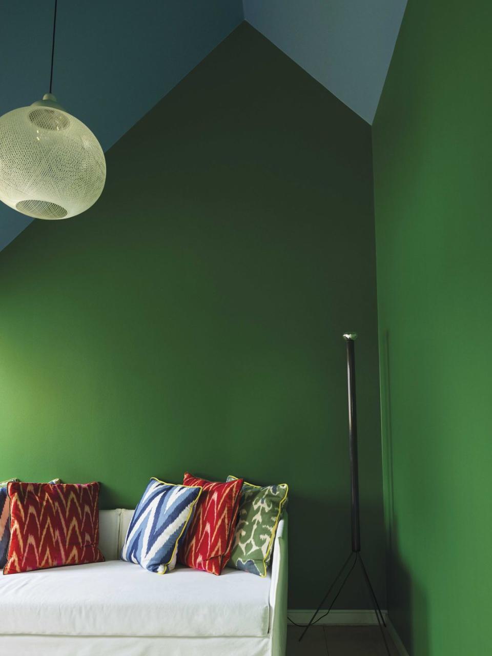
1. Create bold contrasts
At Tapet-Cafe we often experiment with stronger colour pairings such as ‘Danish Lawn’ and ‘Chinese Blue’ and remove white from the scheme altogether

2. Add vibrancy to new surfaces
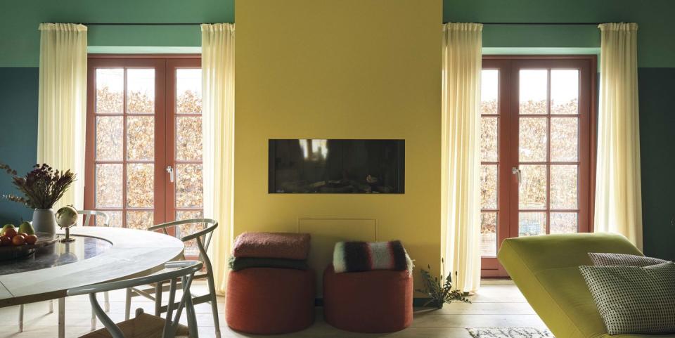
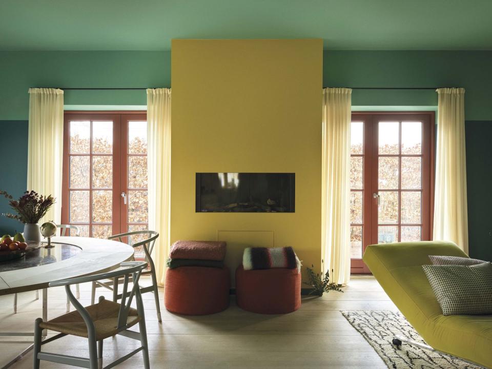
The ceiling is often ignored but is a great canvas. A shade such as ‘Arsenic’ can be brought down onto the walls to create a wonderful open-sky feeling.
3. Think about dramatic pairings
Work together colours that sit next to each other on the colour wheel for a strong effect.
4. Play with finishes
Paint walls and woodwork in a small area, such as a corridor or kitchen, in the same shade in Full Gloss for a unique look that feels a bit arty: ‘Danish Lawn’ and ‘Copenhagen Roof ’ work well.

5. Remember to add delicate touches
Colours that sit well together in nature, such as buttercup yellow, grass green and clear sky blue will also work perfectly in a decorating palette.
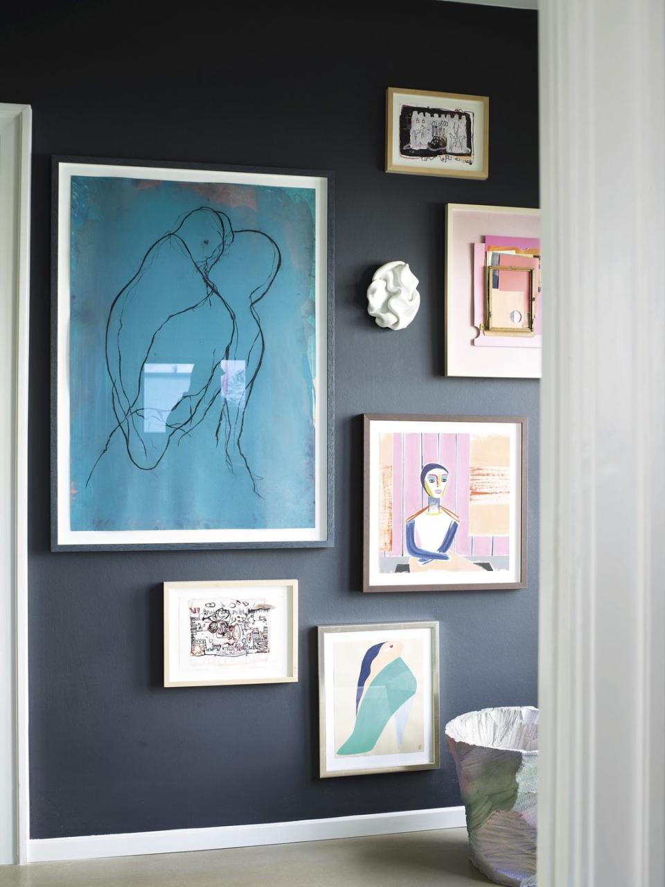
6. Be courageous with bold hues
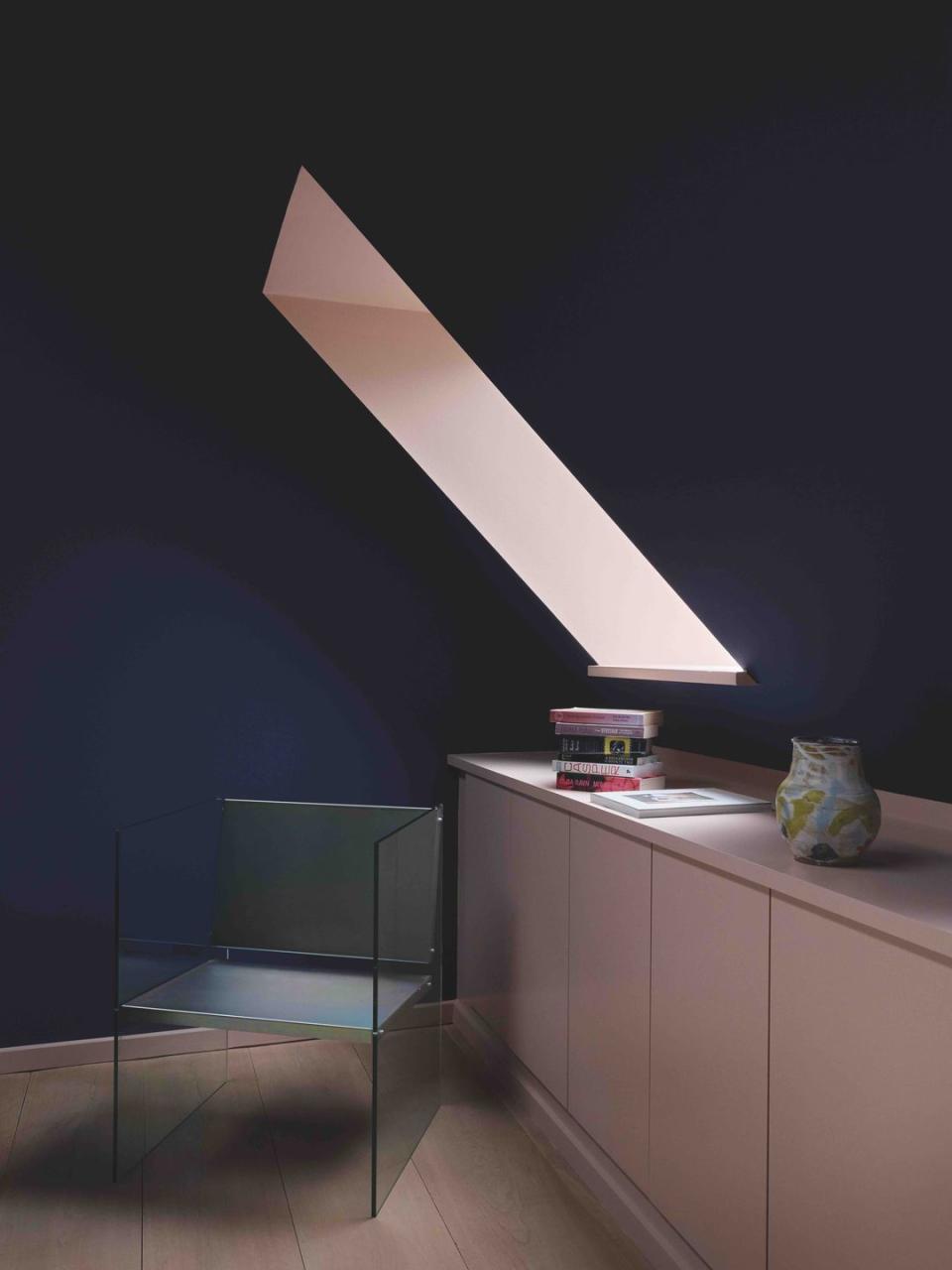
Don’t be afraid to use dark tones, which create drama and atmosphere, and can make a room feel bigger. They’re especially beautiful behind walls full of art: try ‘Railings’ ‘Grate Black’ or ‘Monkey Puzzle’
7. Add a sense of fun with details in accent shades
Try a soft tone like ‘Potted Shrimp’ in a window niche, for example, offset against a wall in a darker shade such as ‘Serge’.
8. Consider the balance of darkness and light
Introduce muddier tones with paler hues, this will prevent classically 'pretty' shades looking childish.
This article first appeared in ELLE Decoration April 2021
Like this article? Sign up to our newsletter to get more articles like this delivered straight to your inbox.
Keep your spirits up and subscribe to ELLE Decoration here, so our magazine is delivered direct to your door.
